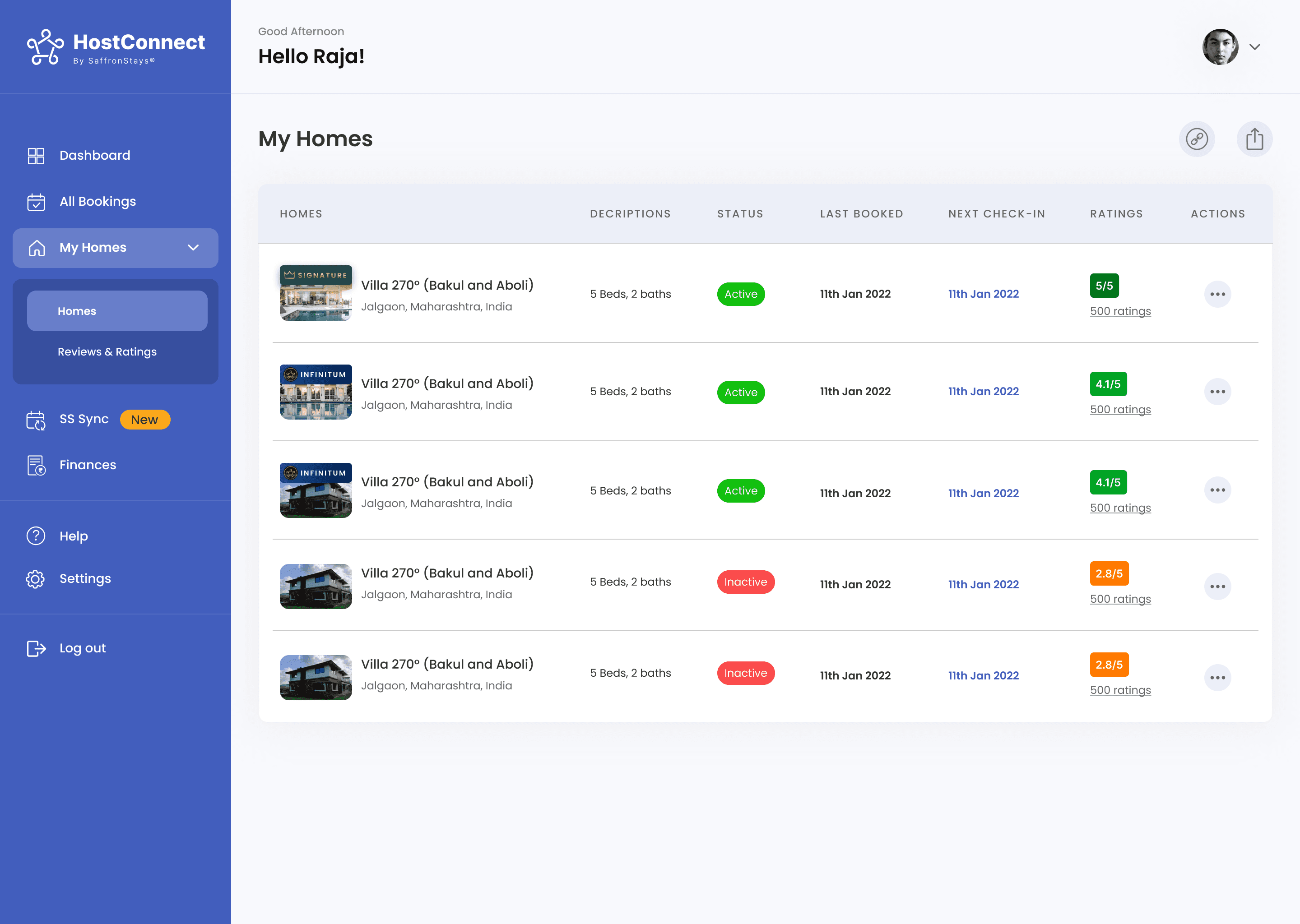
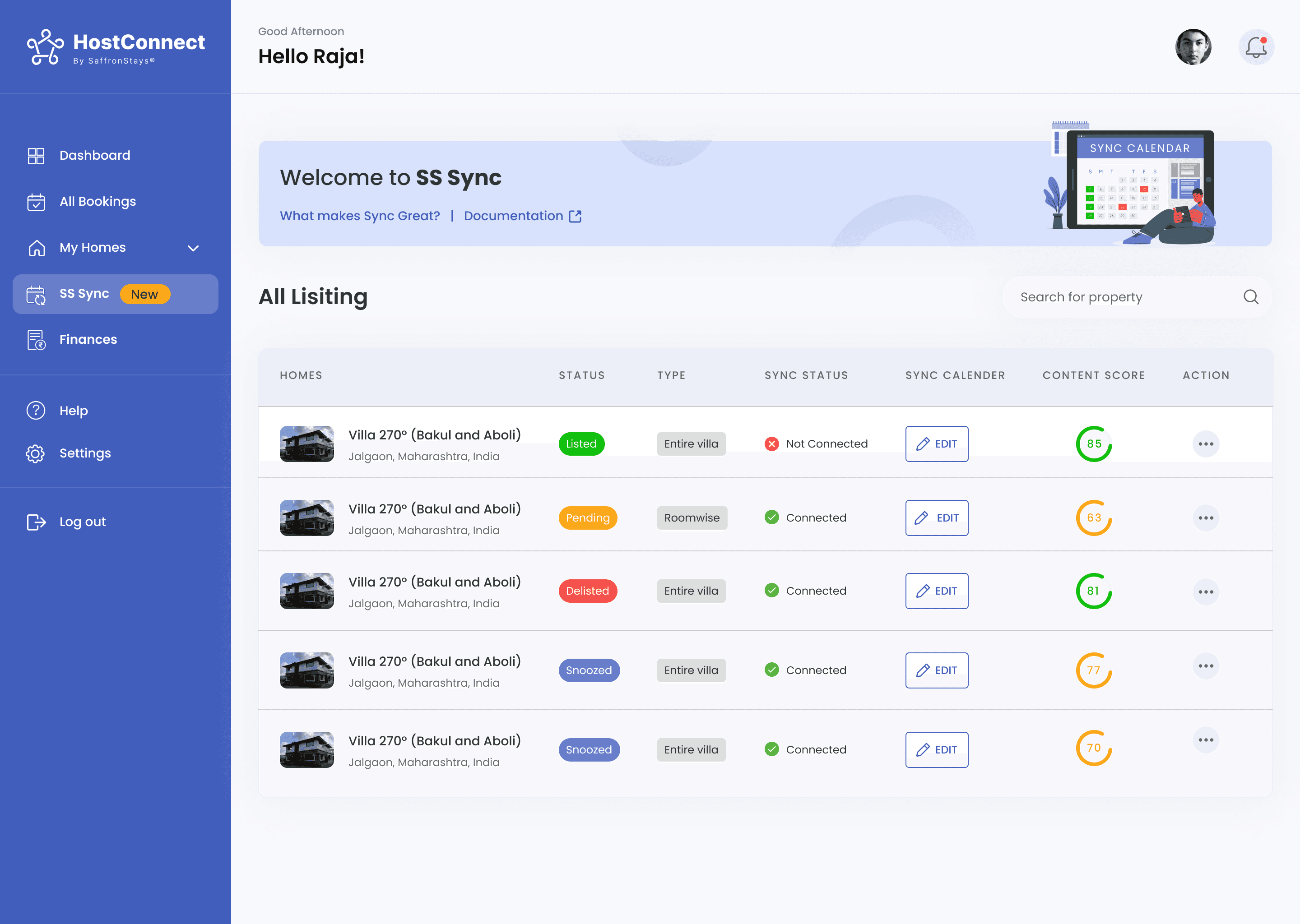
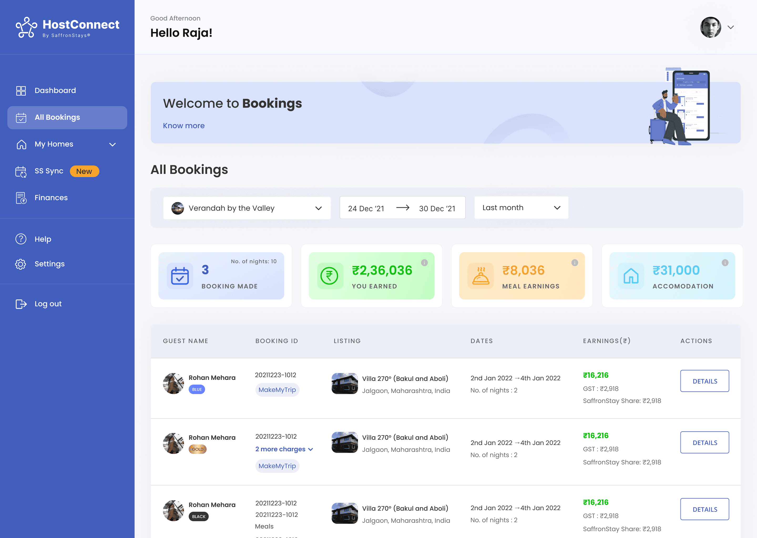
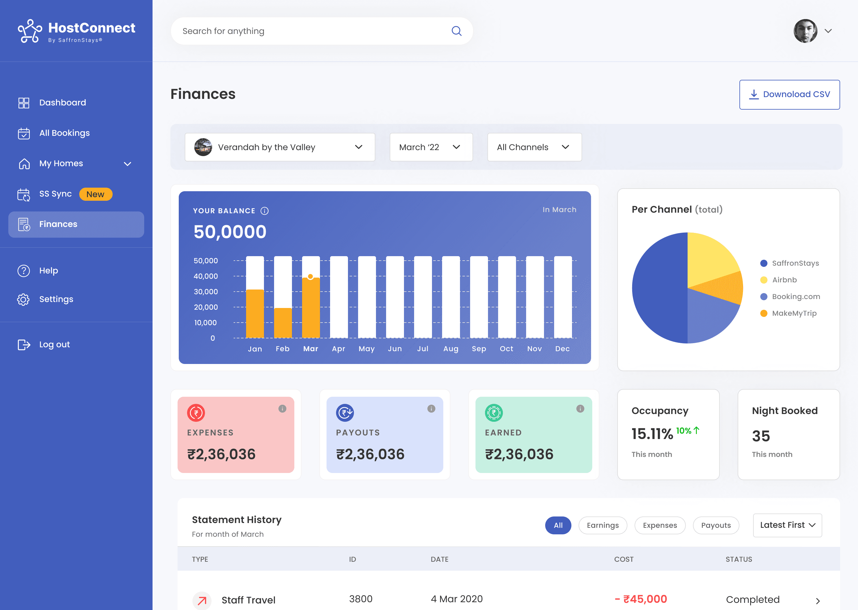
SYNC
Product
SYNC by SaffronStays
Role
Product Designer
Team
1 Designer
1 Product Manager
Stage
0 → 1 MVP
Project Overview
Problem Space
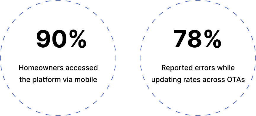
78% of vacation rental homeowners were managing rates and inventory manually across multiple OTAs, on a platform that was a single-page form with barely any capability. 90% of them were doing it on mobile. The result booking conflicts, missed reservations, and lost revenue. Not because they weren't trying but because the tool was failing them.
Project Goals
01. Help homeowners manage listings across OTAs from one place
02. Improve mobile accessibility for property updates on the go
03. Reduce sync errors and booking discrepancies
04. Boost property visibility and maximise occupancy
Constraints
01. Legacy system limitations
Started with no usable UX structure only a basic form page.
02. Solo UX lead
Managed everything from research to high-fidelity design and testing as the only designer on the team.
03. Mobile-first priority
Had to ensure full functionality and ease of use on small screens across varied devices.
The Solution: A smart channel manager simplifying property operations
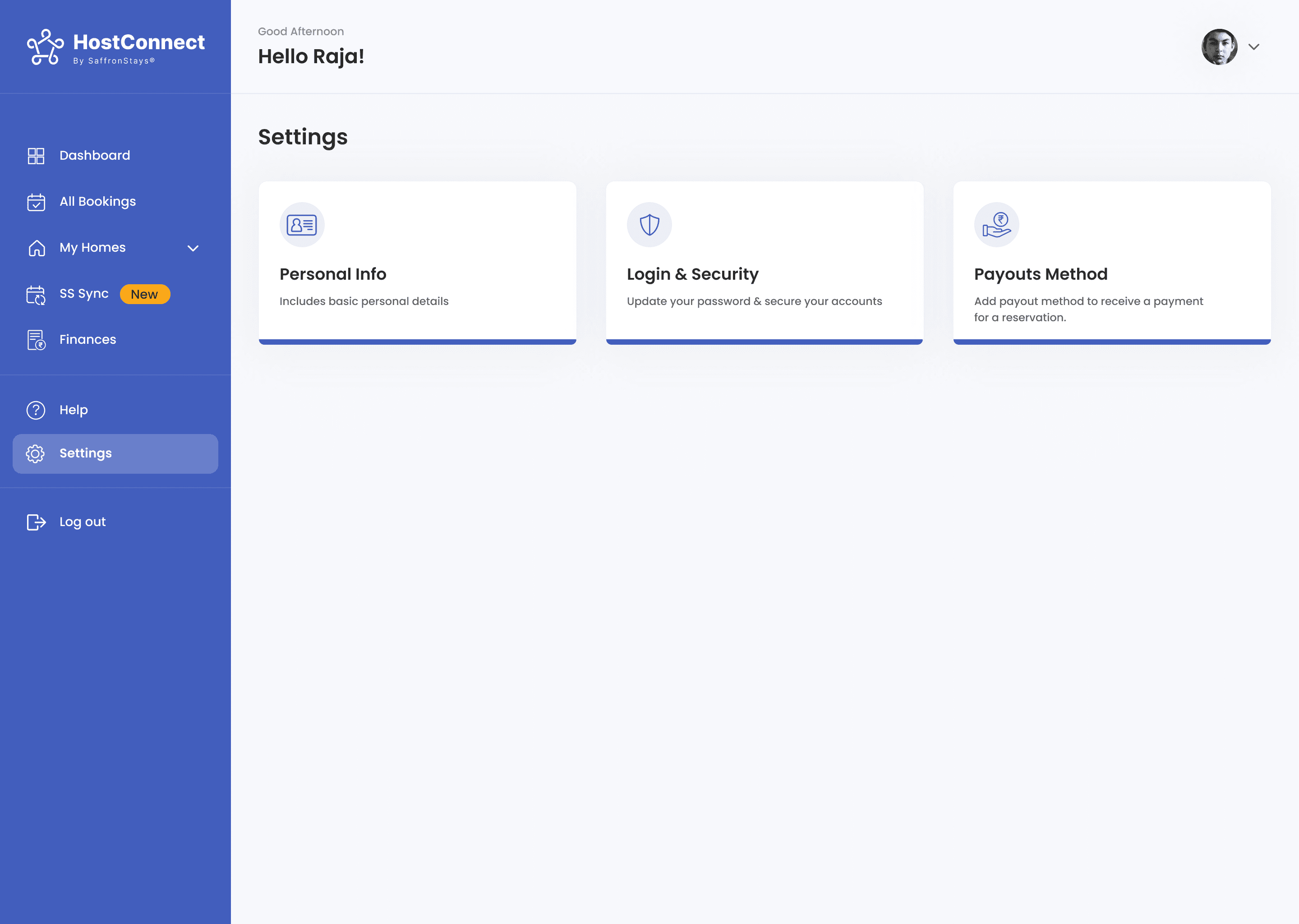
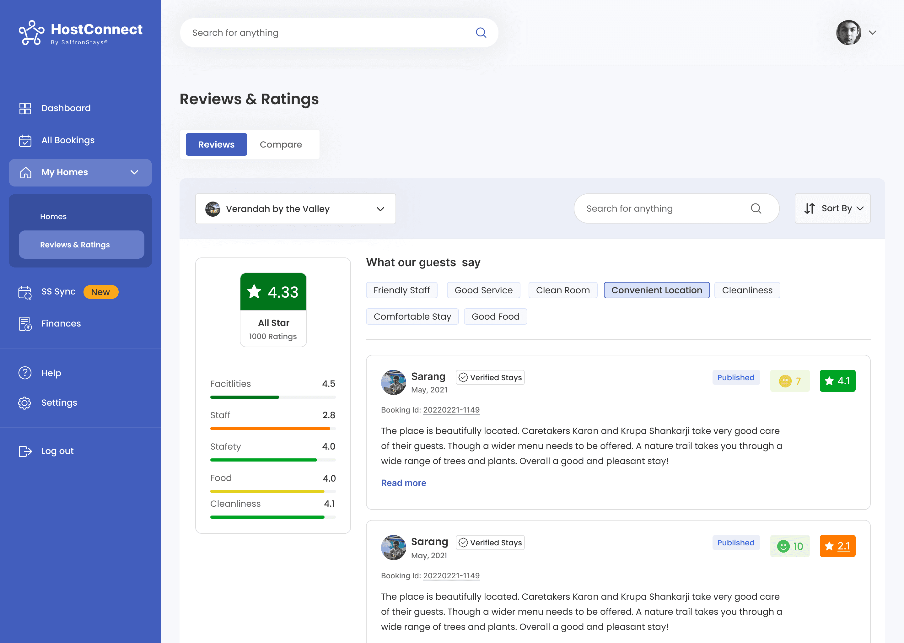
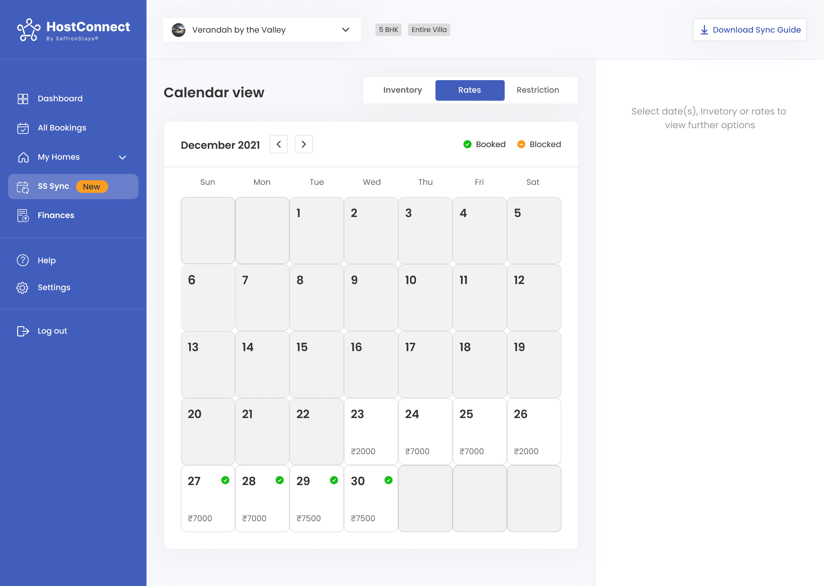
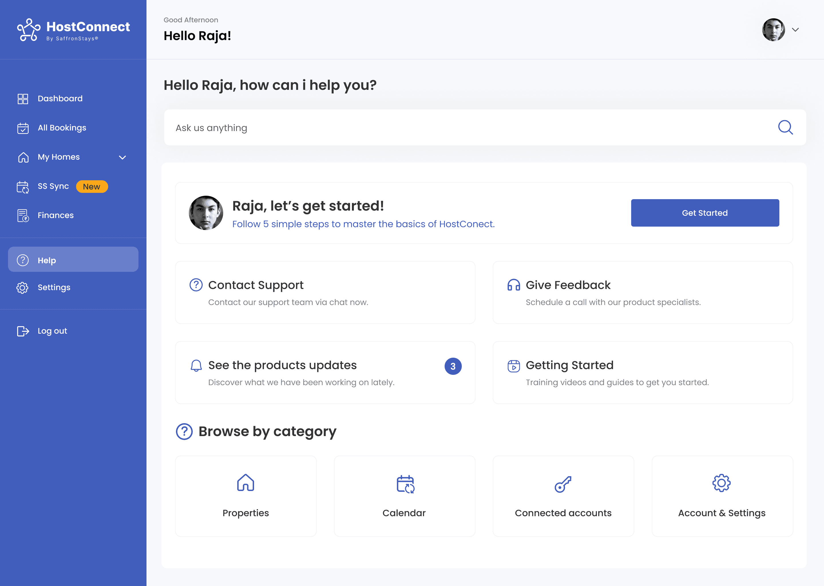
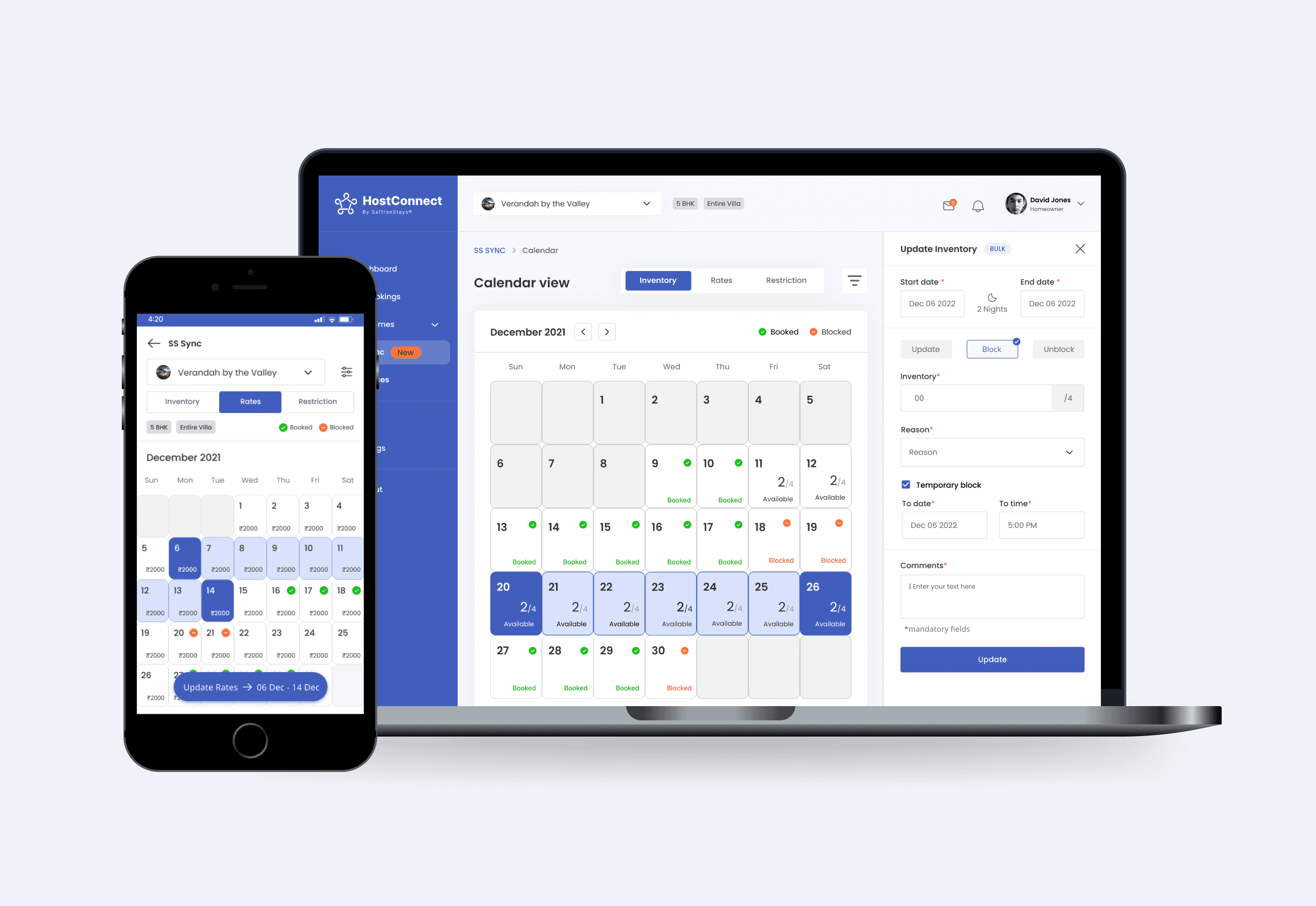
To support homeowners in the hospitality sector, I designed an intuitive channel manager web app that syncs rates, inventory, and availability across multiple OTAs. The platform simplified day-to-day property operations by enabling quick updates, streamlined booking management, and reduced dependency on manual coordination all from a mobile device in just a few simple taps.
Result & Impact
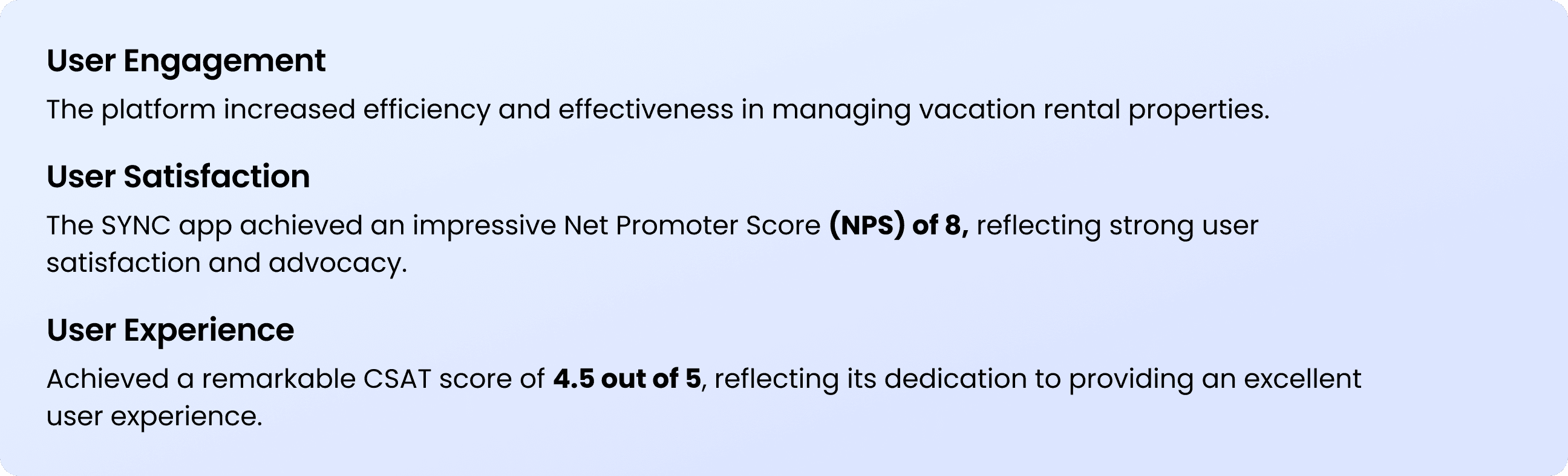
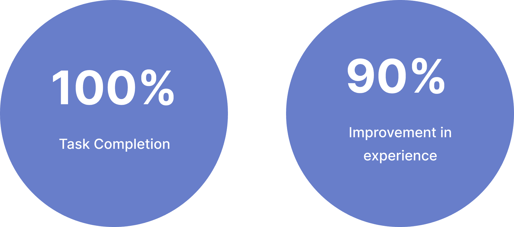
The newly designed workflow improved operational visibility by allowing homeowners to manage rates and availability more efficiently across multiple booking platforms.
By reducing manual verification effort and simplifying high-frequency tasks, the platform enabled faster inventory updates, improved booking accuracy, and smoother day-to-day property management.
Process
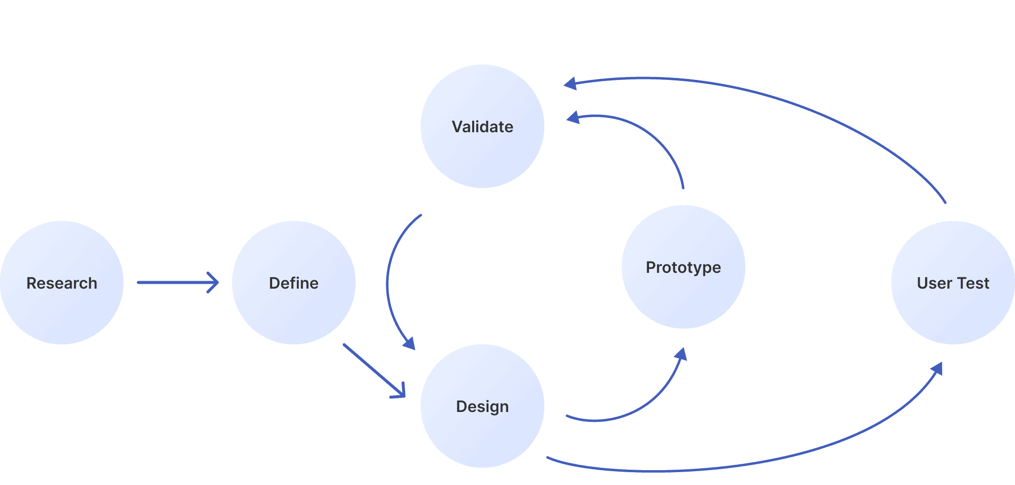
While the design process appeared straightforward, it involved continuous iteration and revisiting earlier stages to refine the experience. Each step was guided by real user feedback and aimed at crafting a solution that genuinely solved homeowners’ pain points and helped them manage their properties with ease.
Research
QUANTITATIVE RESEARCH
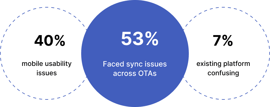
Challenges Faced by Vacation Rental Homeowners : 78% Faced Sync Issues
USER INTERVIEW
Key Obstacles: Manual Updates, Platform Inconsistencies, and Lack of Mobile Optimisation
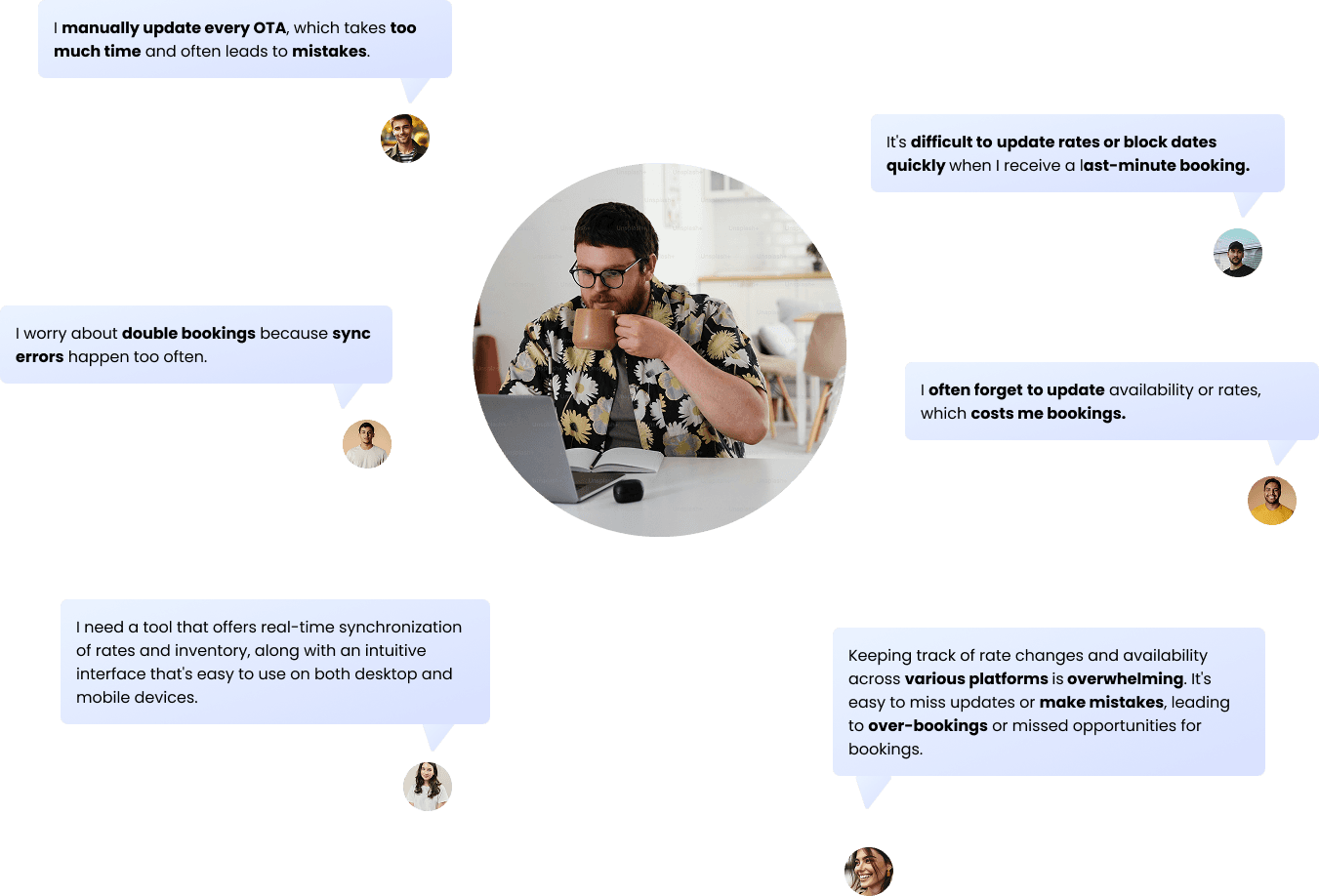
I interviewed 6 homeowners managing vacation rentals to uncover their pain points and explore how SYNC could streamline multi-OTA property management.
And, they said
Key Insights
Analysing the interview data revealed that the biggest challenge for homeowners was managing multiple OTA listings manually, especially on mobile. This often led to sync errors, missed bookings, and a sense of overwhelm when handling availability and rates across platforms.
Define
USER PERSONA
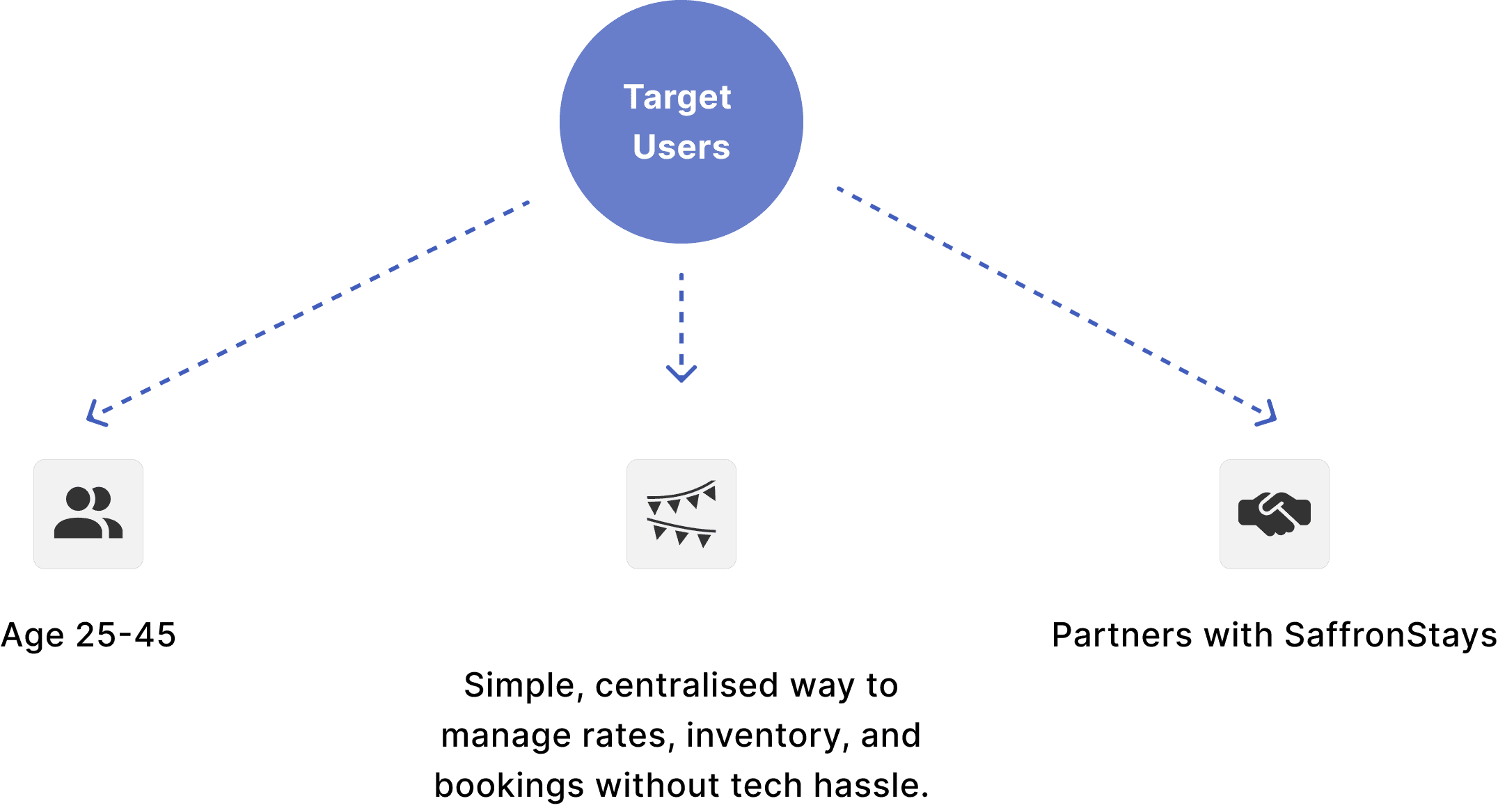
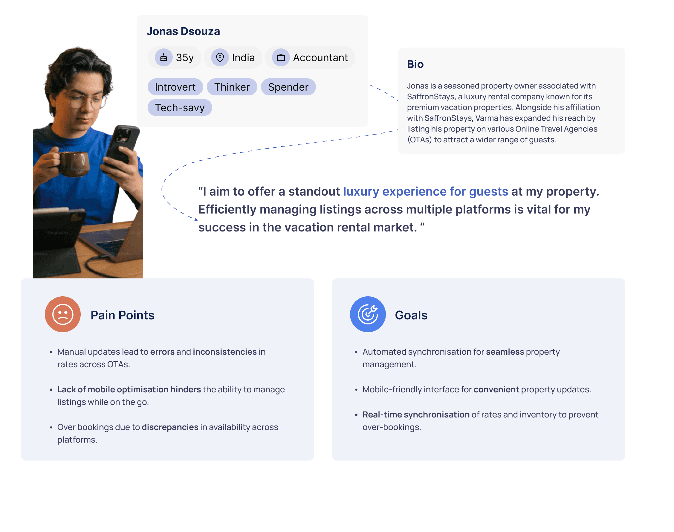
Targeting homeowner managing vacation rentals (25 - 45). Struggling to sync & manage property
USER JOURNEY
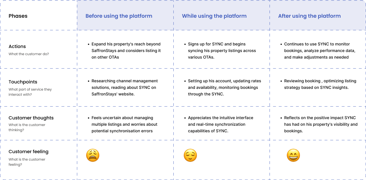
Managing multiple listings without a system leads to frustration and errors
Understanding user pain points, goals, and motivations, I crafted a user journey for the SYNC platform. This scenario depicts how homeowners would interact with SYNC to manage their vacation rental properties seamlessly and achieve their goals efficiently.
INTIAL TASK FLOW
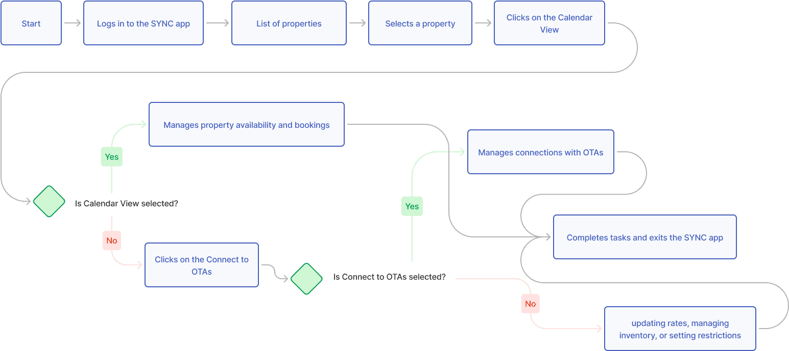
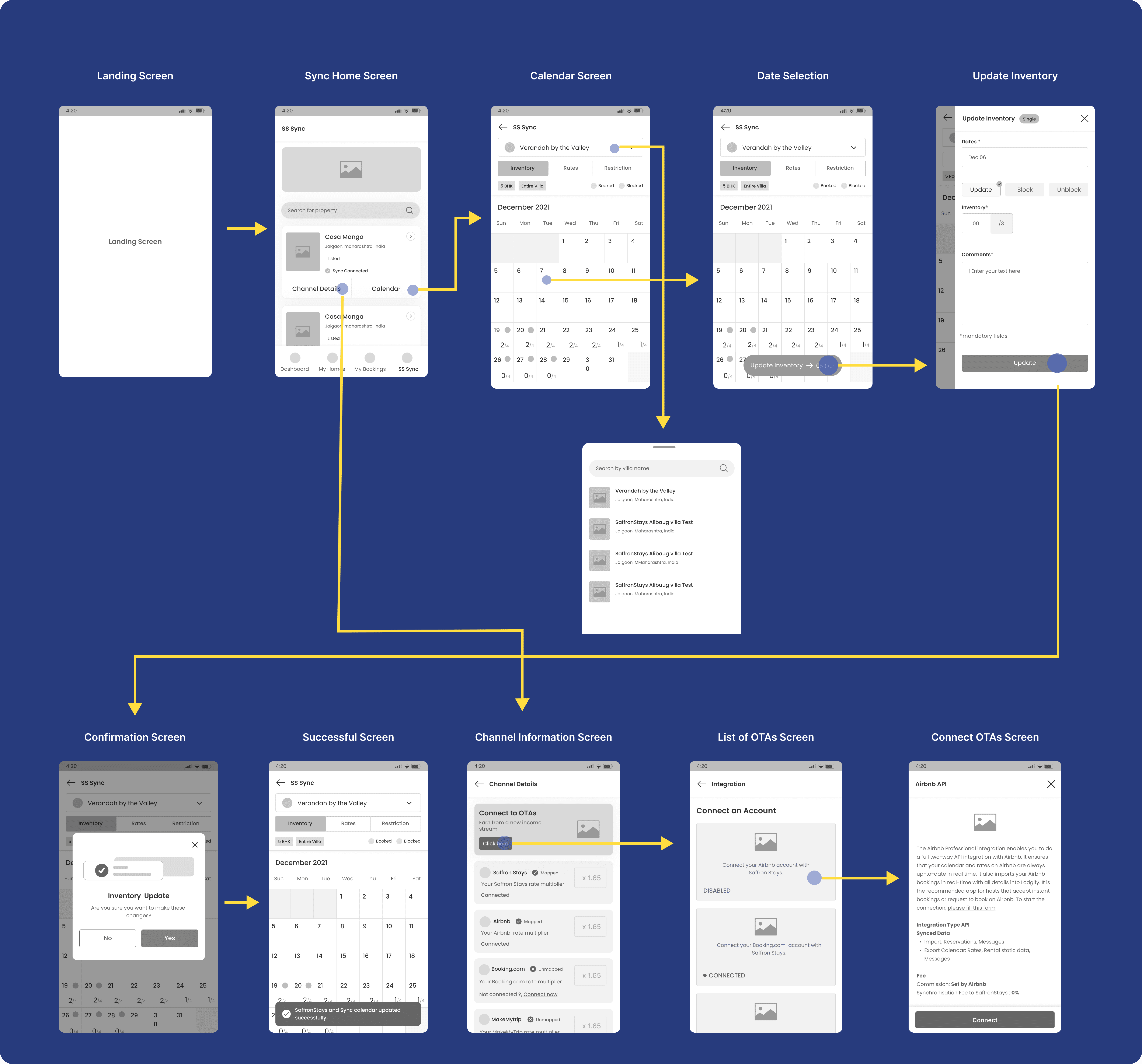
User Flow - Launch the app to access calendar view and connect OTA
This user flow assumes the user is using the app for the first time
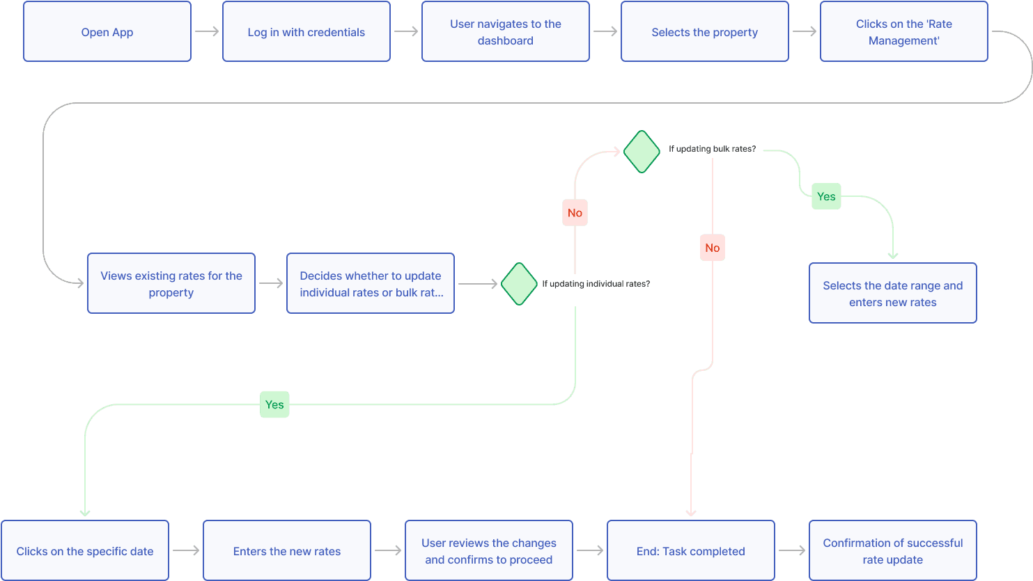
Task Flow : Update rates of a listed properties
Design
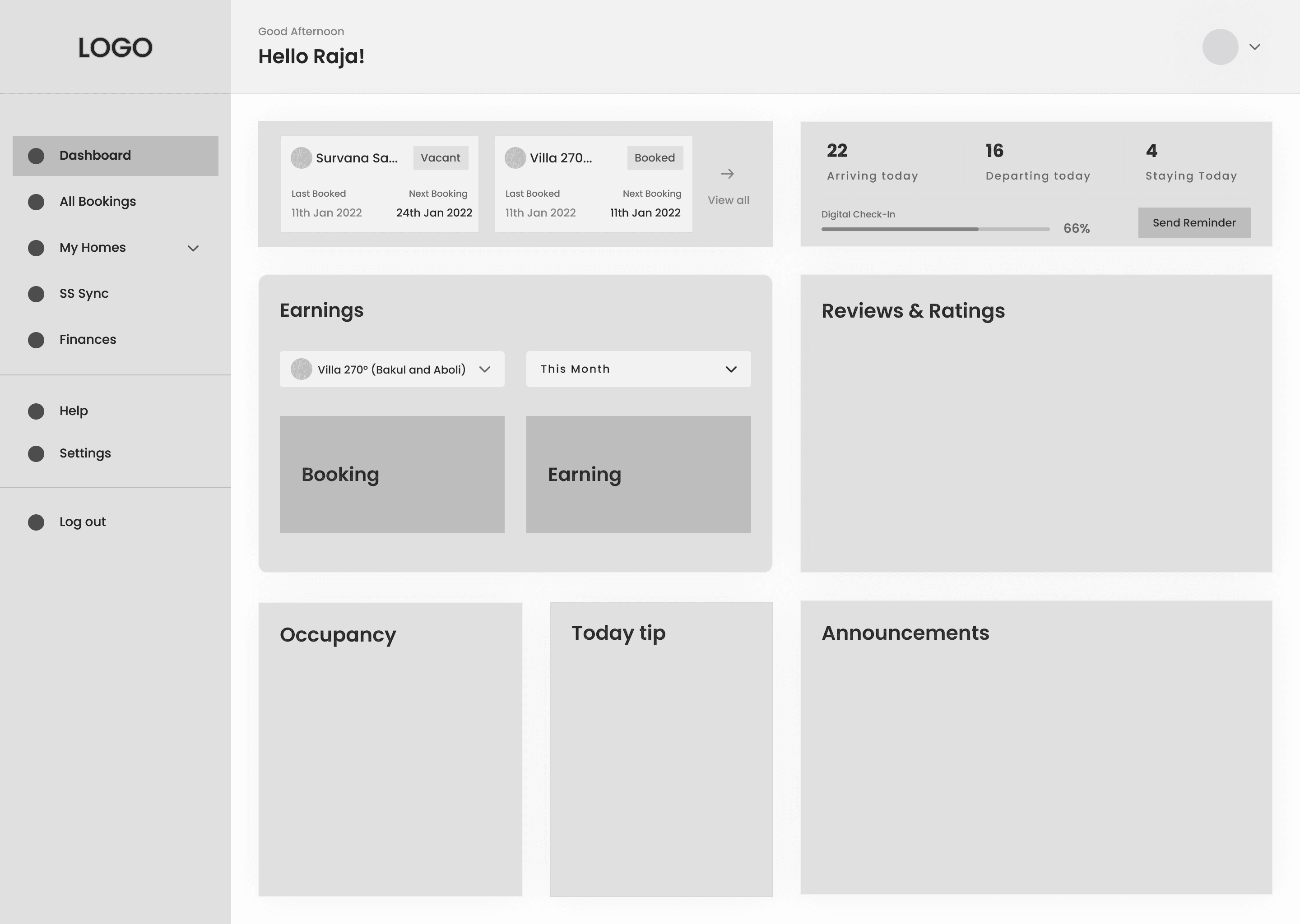
SKETCHES
Brainstorming Features with Rapid Prototyping
With the user flow established, I began sketching potential features and necessary information for each screen. This rapid ideation process helped me brainstorm functionalities and ensure a smooth progression between screens.
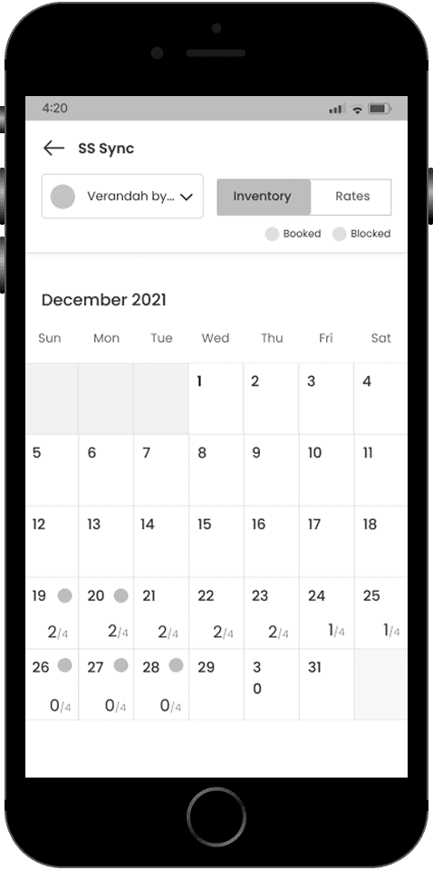
Calendar Management Screen
🔍 Opportunity
Help users easily view and edit property availability across dates and OTAs.
✨ Feature
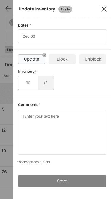
A centralised Calendar Screen showing booked, blocked, and available dates, with quick-access buttons to update inventory, rates, or apply restrictions.
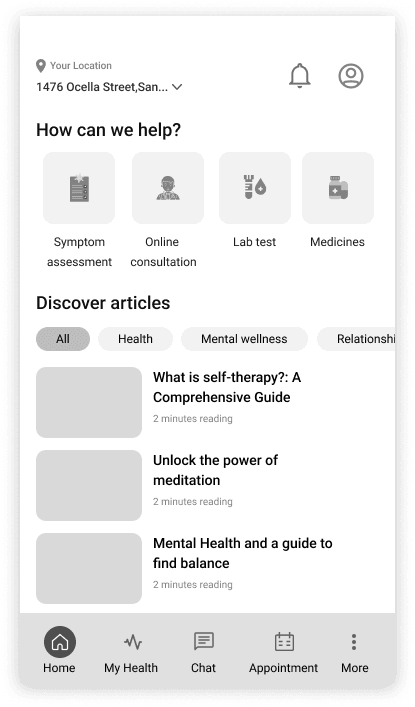
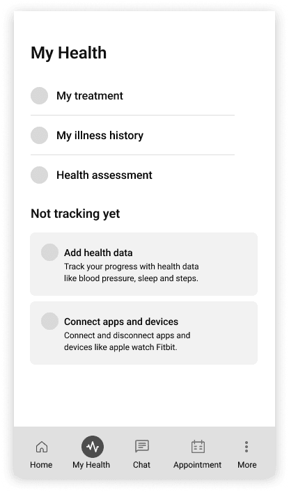
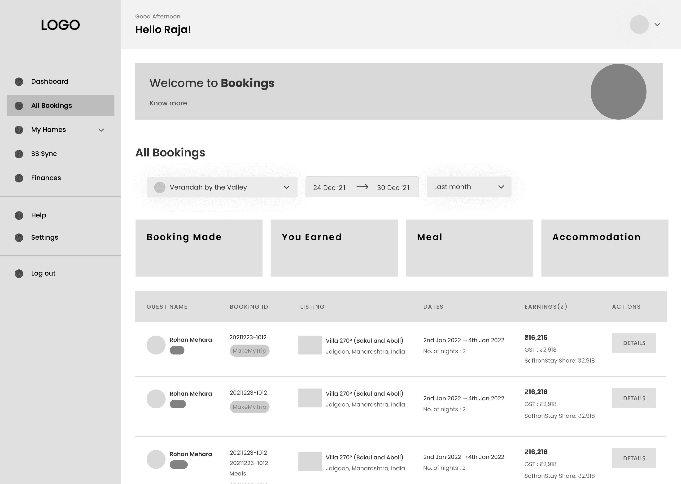
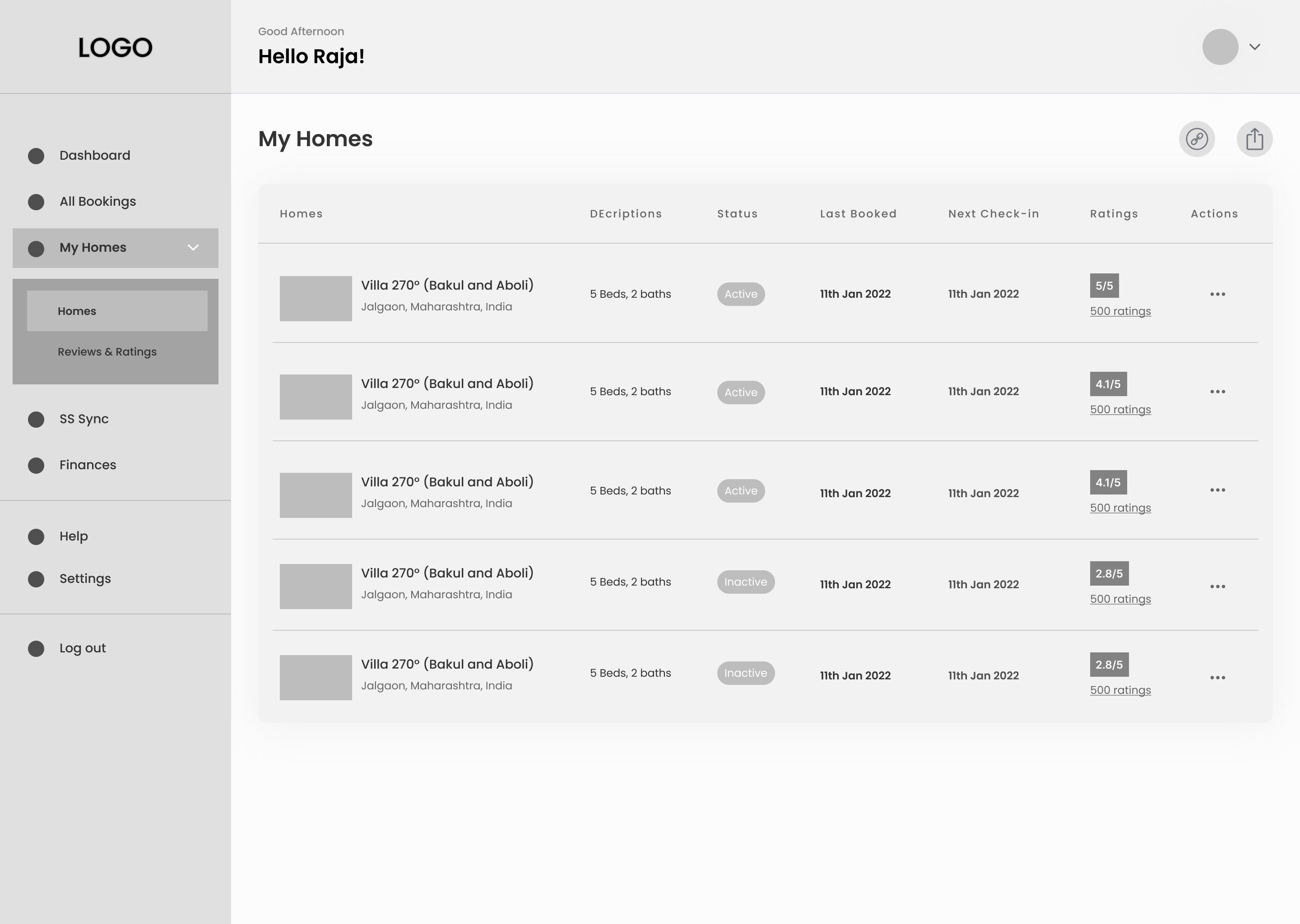
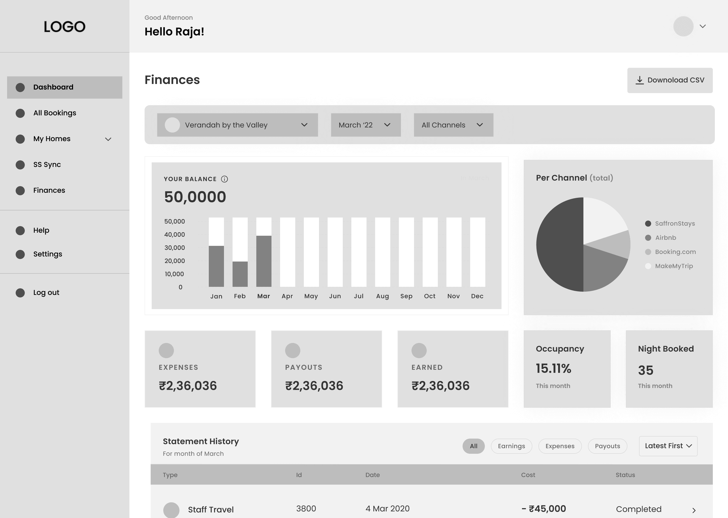
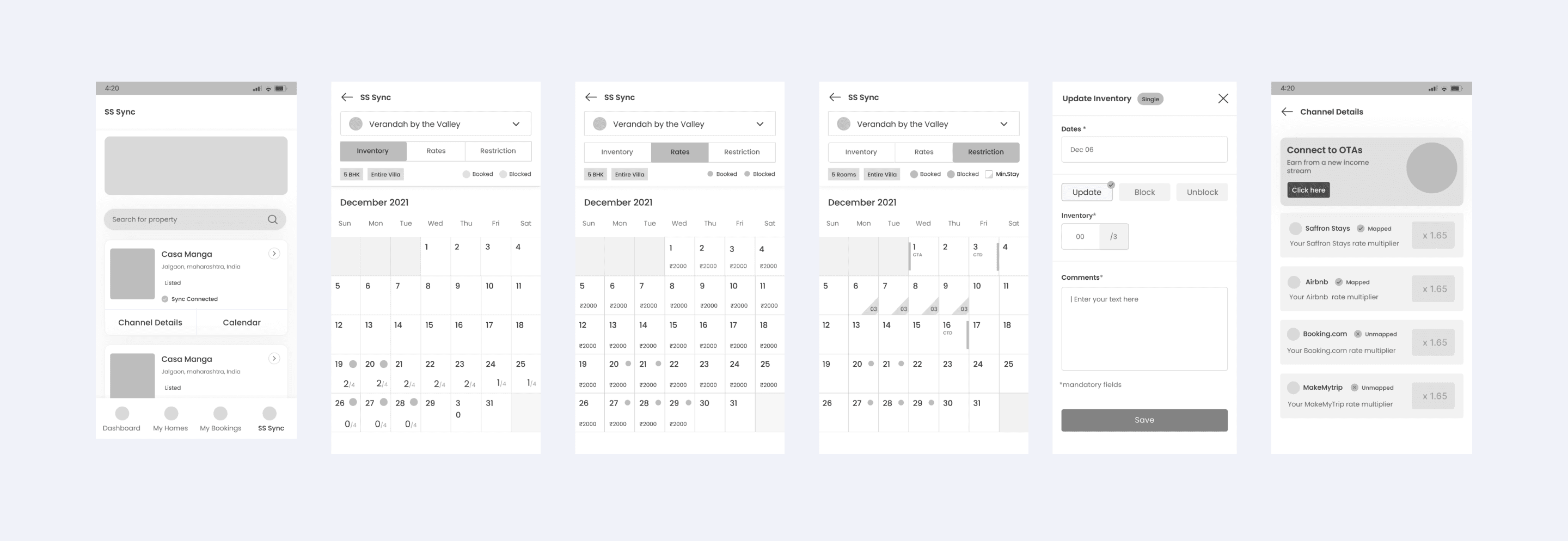
LOW FIDELITY WIREFRAMES
Turning sketches into Low Fidelity Wireframes: Visualising Users Interactions
After defining the main user task and flow, I attempted to create the first set of lo-fi wireframes to run some preliminary testing with the actual users. That allowed me to gather some initial feedback and save time later in the process before I started the high-fidelity prototype.
The first round of testing I decided to make a couple of iterations that included:
1. Making the Calendar mobile friendly and intuitive.
2. Enhancing the visual hierarchy to highlight important features and information effectively
3. Clarifying instructions and labeling to reduce ambiguity and enhance user understanding
USABILITY TESTING
The Sooner I Test, the Better the User Experience

I know it too well.
After I have worked on this design for a few weeks, I couldn’t see it freshly anymore. To truly assess its effectiveness, I needed to see how my target users interacted with it.
TEST RESULT
Uncovering Usability Issues (2 Rounds, 10 Participants)
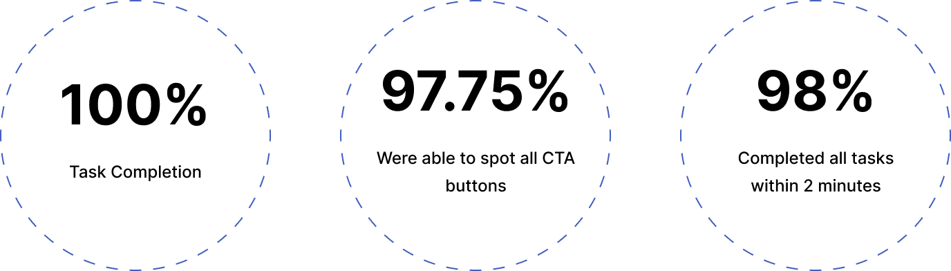
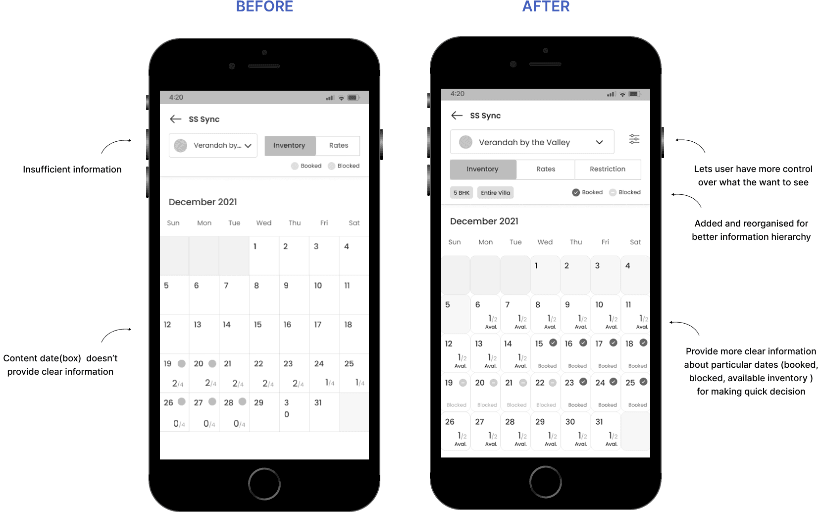
1. Add elements that would lead users to desired actions.
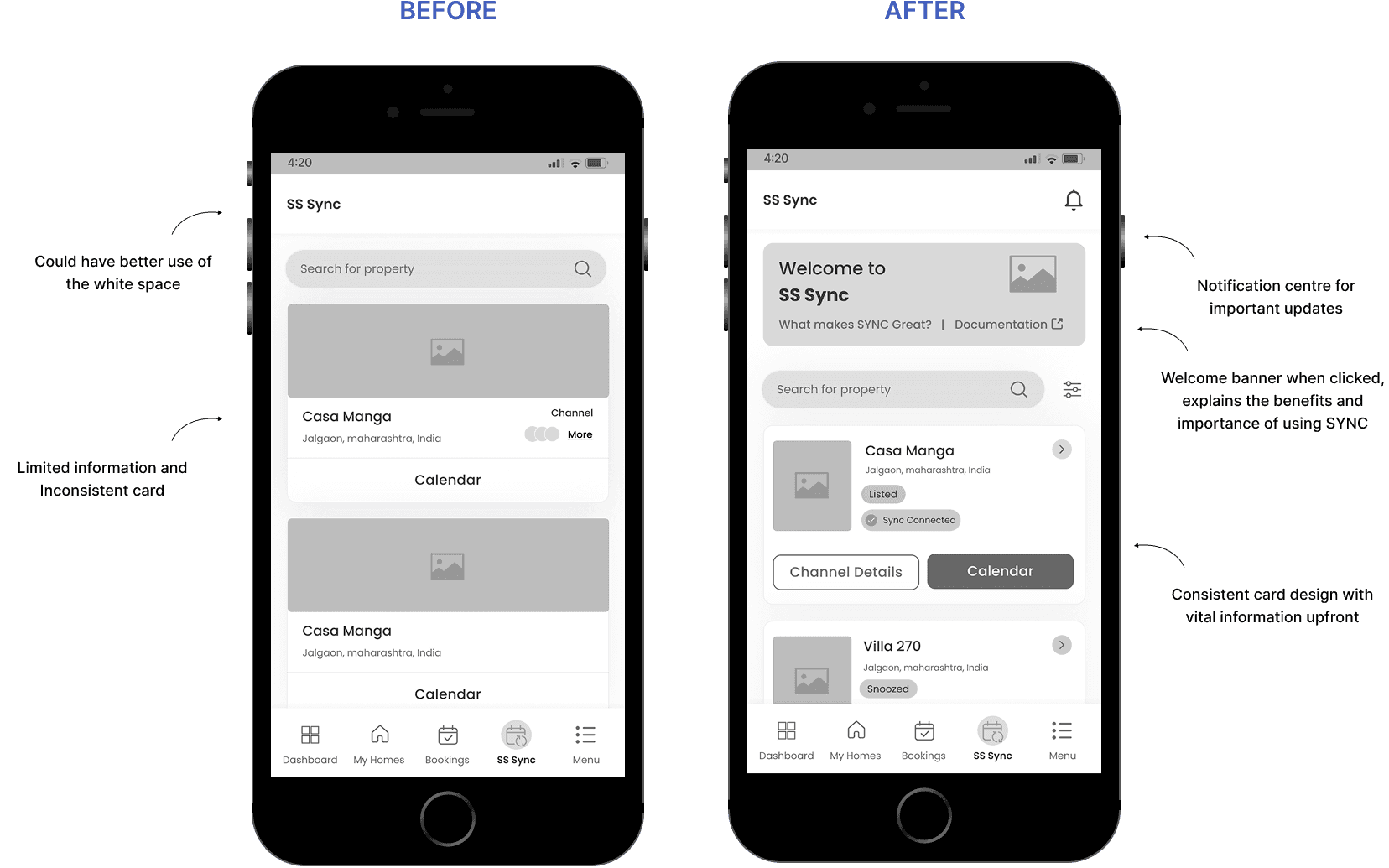
2. Consistent Designs for elements such as property cards and calendar elements.
3. Make CTA buttons more accessible and visible.
BEFORE & AFTER
User testing fueled this design's evolution. These prototypes showcase the journey, with the initial iteration on the left and the final improved version on the right. Each change reflects valuable insights gathered from user feedback.
Design System
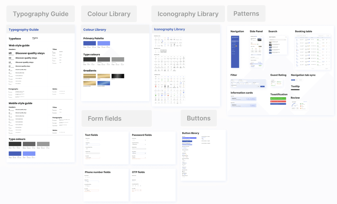
DESIGN SYSTEM
Creating a Clear and Confident Experience with Accessible Colours and Typography
User testing guided the design evolution of SYNC. These prototypes illustrate the process from early wireframes to the polished final version where each improvement was shaped by real homeowner feedback to make property management simpler and more intuitive.
Final Screen
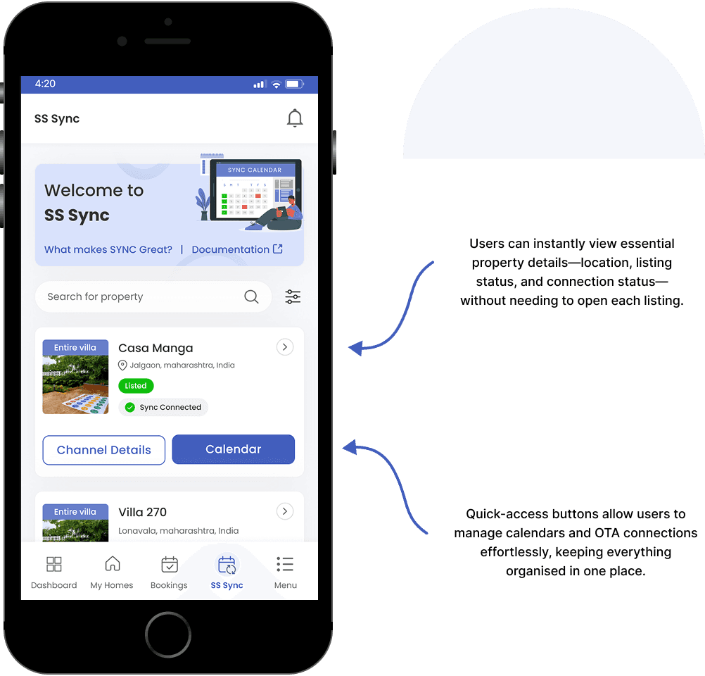
01 - HOME SCREEN
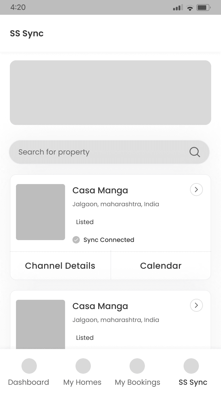
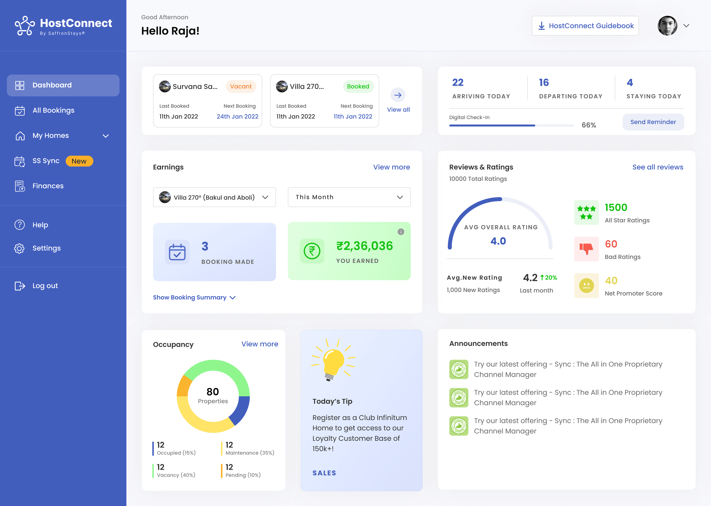
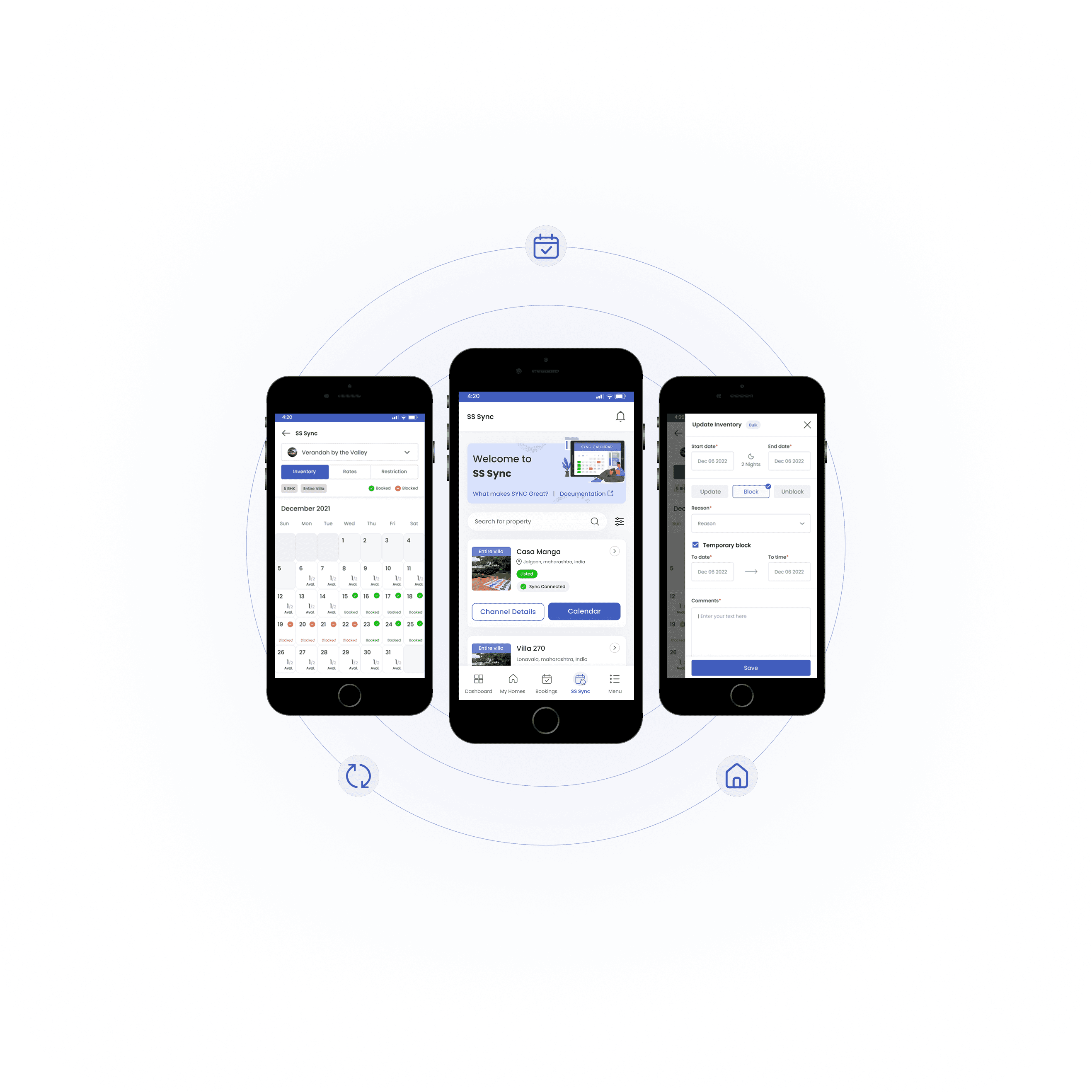
The home screen provides homeowners with a clear overview of their listed properties at a glance. Users can quickly search for a property, check connection status, and access key actions like viewing the calendar or managing channel details all in one place for effortless day-to-day management.
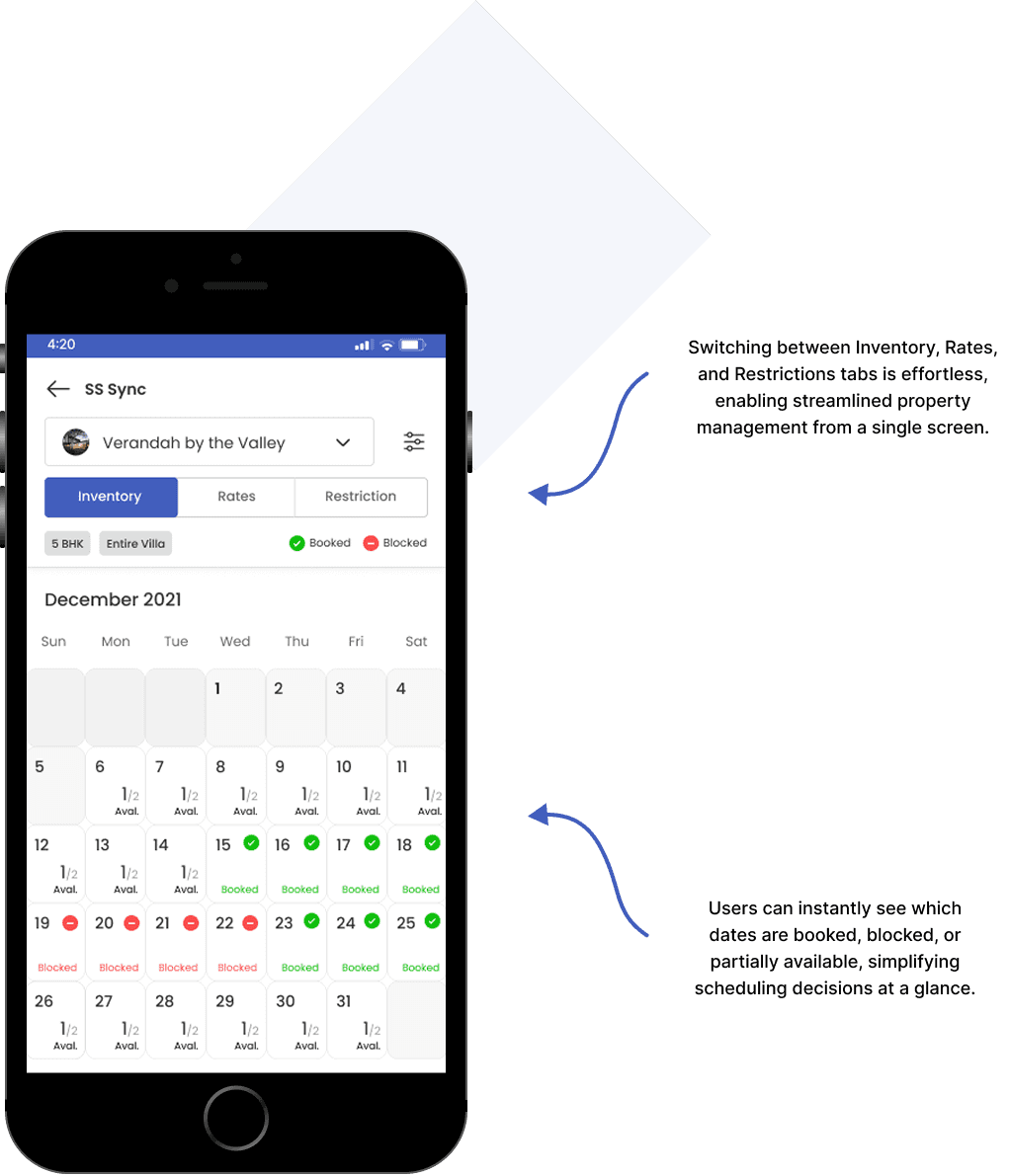
02 - CALENDAR SCREEN
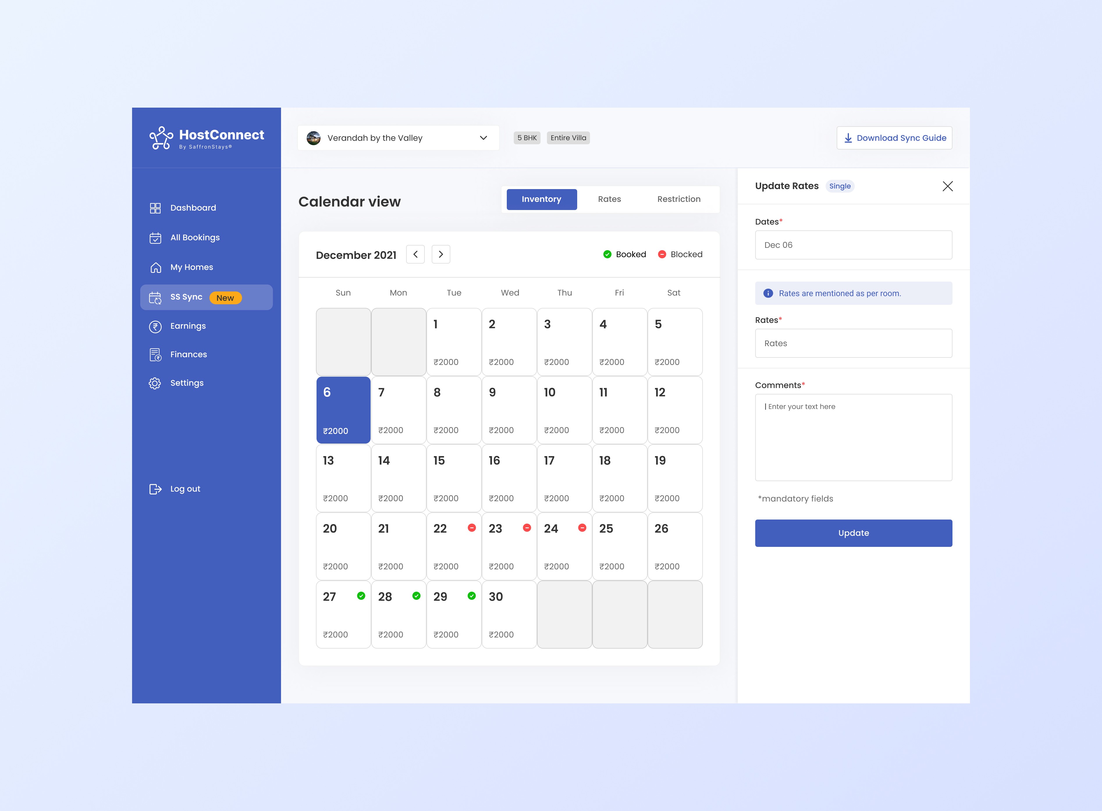
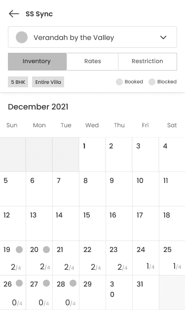
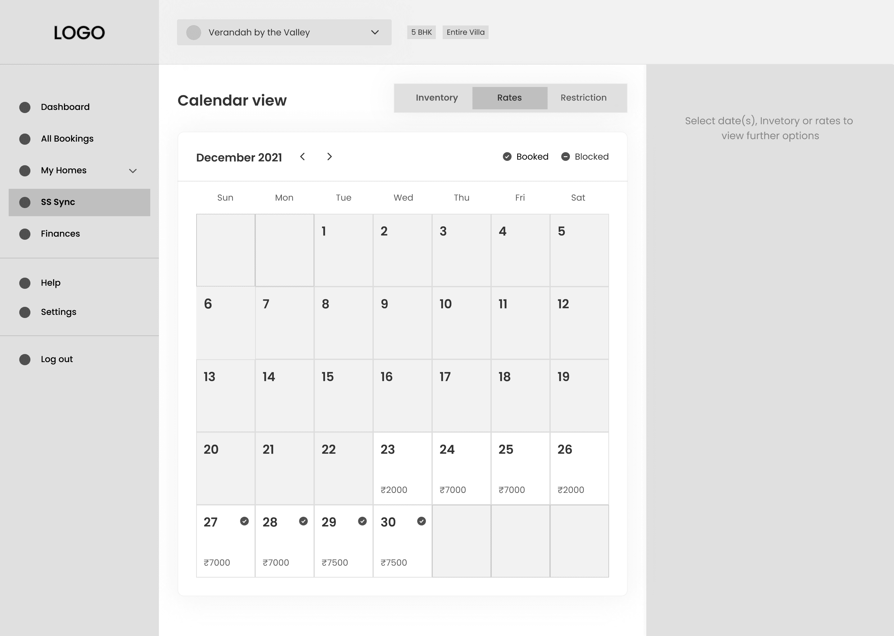
The Inventory Calendar screen provides a clear, month-view overview of each property’s availability, bookings, and blocked dates. With intuitive visual indicators, homeowners can quickly assess occupancy and manage inventory without confusion.
INVENTORY SCREEN
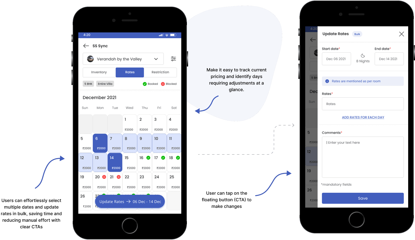
RATE SCREEN
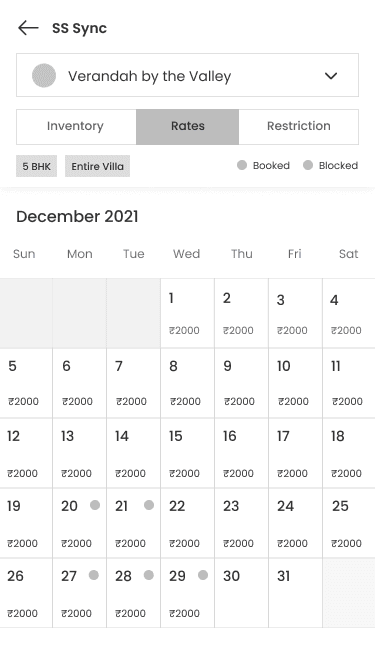
The Rates Calendar screen allows homeowners to view and update nightly rates for each property in a clear monthly layout. With just a few taps, users can adjust pricing over selected date ranges, ensuring optimal revenue management.
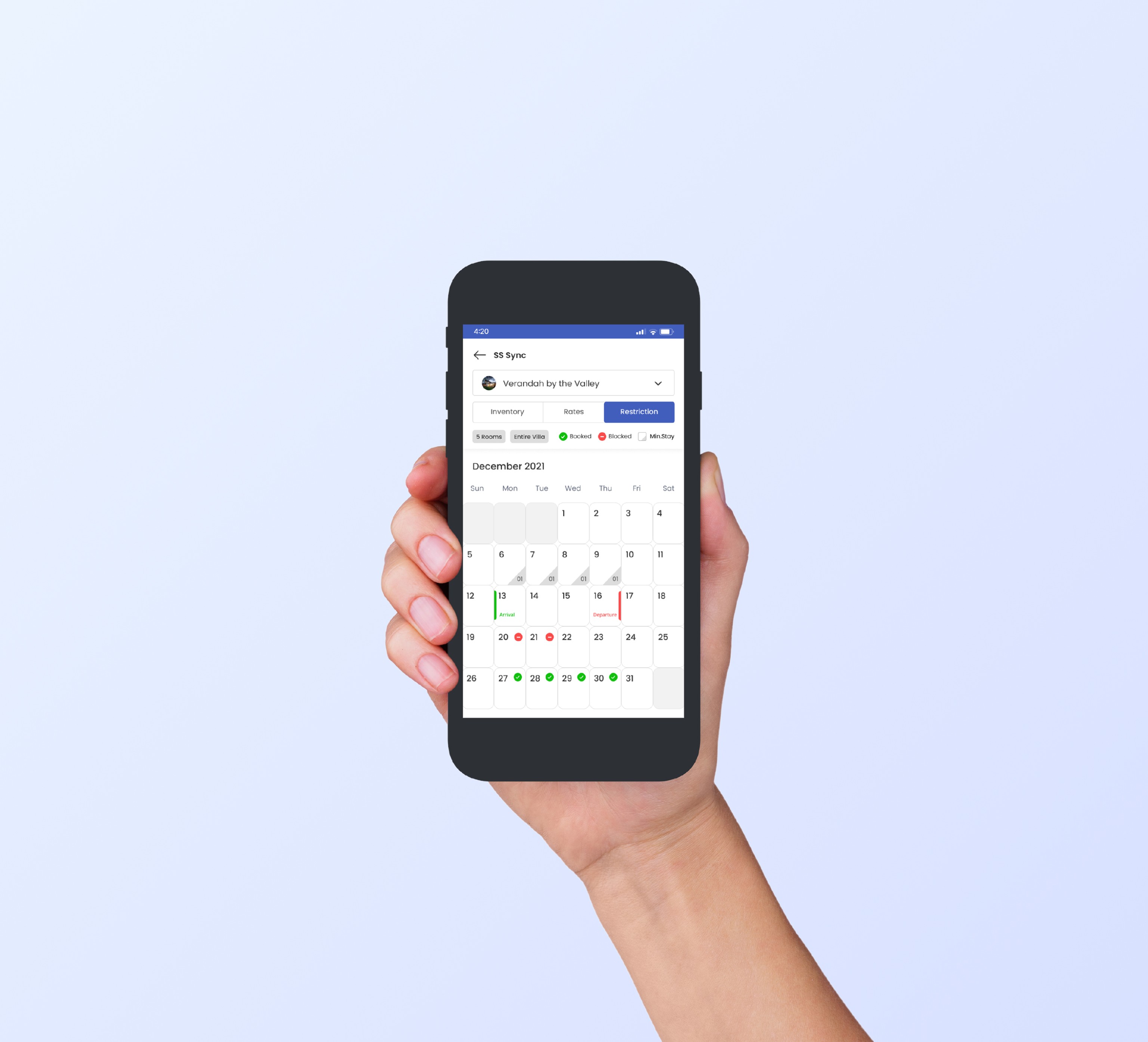
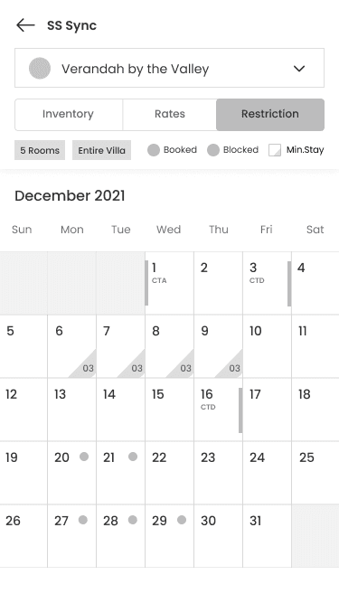
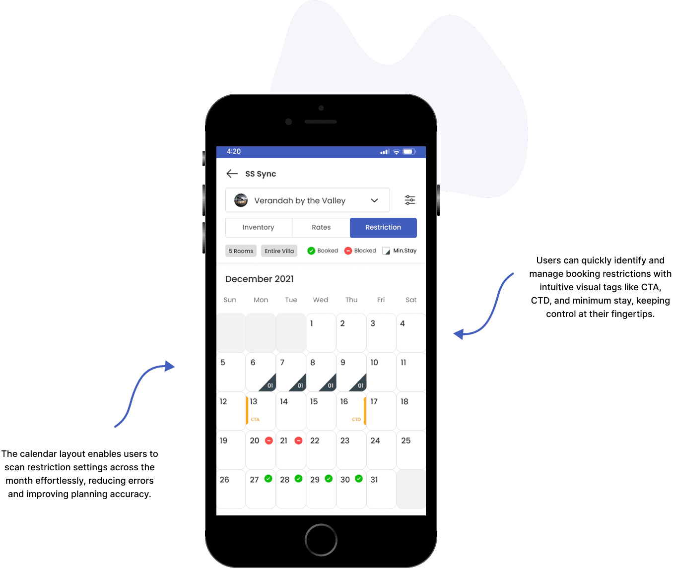
The Restriction screen in SYNC gives property owners a quick overview of booking limitations like minimum stays and restrictions such as Close to Arrival (CTA) or Close to Departure (CTD), helping them fine-tune their booking rules for maximum efficiency and control.
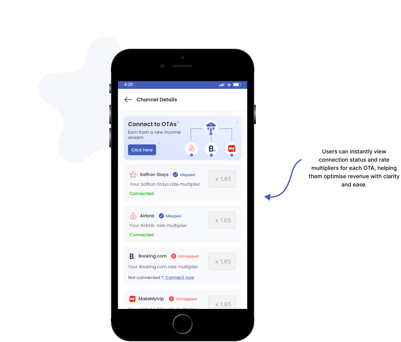
CHANNEL DETAILS SCREEN
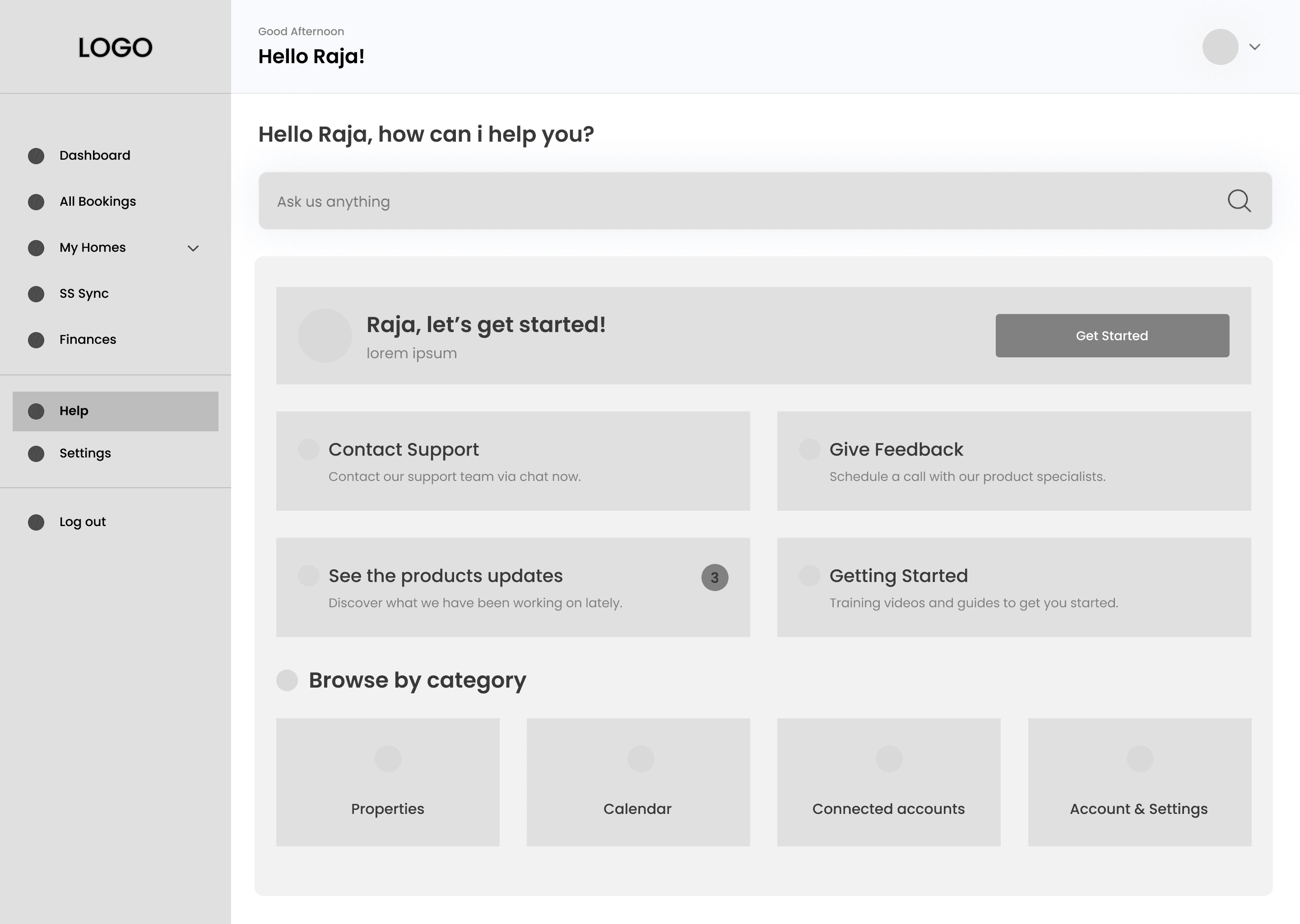
The Channel Details screen enables homeowners to seamlessly connect and manage their listings across multiple OTAs (Online Travel Agencies), ensuring wider visibility and better control of rate multipliers—all from a single, easy-to-navigate interface.
Key Learnings & Next Steps
KEY LEARNING
Continuous Learning: User Feedback, Iteration, & Design Inspiration
Embrace Your Feedback
Actively incorporating user feedback throughout the design process leads to more user-centric solutions and improved overall satisfaction.

Embrace Iteration
Embracing iteration allows for refinement and enhancement of designs, ensuring they evolve to meet user needs and business goals over time.

Learn from other designers
Studying and collaborating with fellow designers fosters a culture of continuous learning, inspiring fresh ideas and innovative approaches.
NEXT STEPS
Continuous Learning: User Feedback, Iteration, & Design Inspiration
Product Sustainability: Supporting long-term user engagement by adding advanced reporting tools and insights to help homeowners optimise their listings.
Security: Enhancing platform security to protect listing data and prevent booking fraud.
Artificial Intelligence: Exploring AI-powered recommendations for pricing, availability, and performance improvements to further assist homeowners.