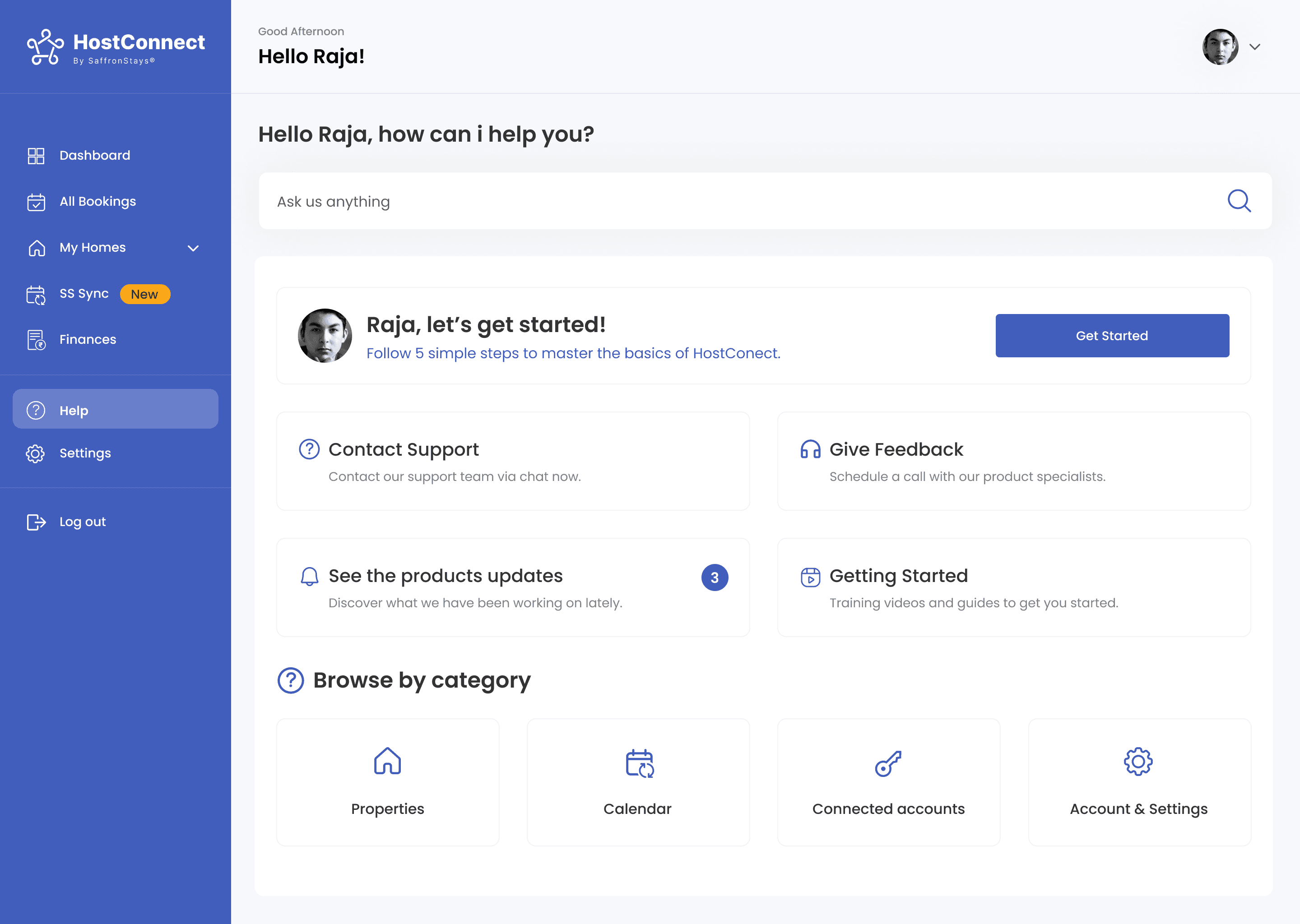
HostConnect
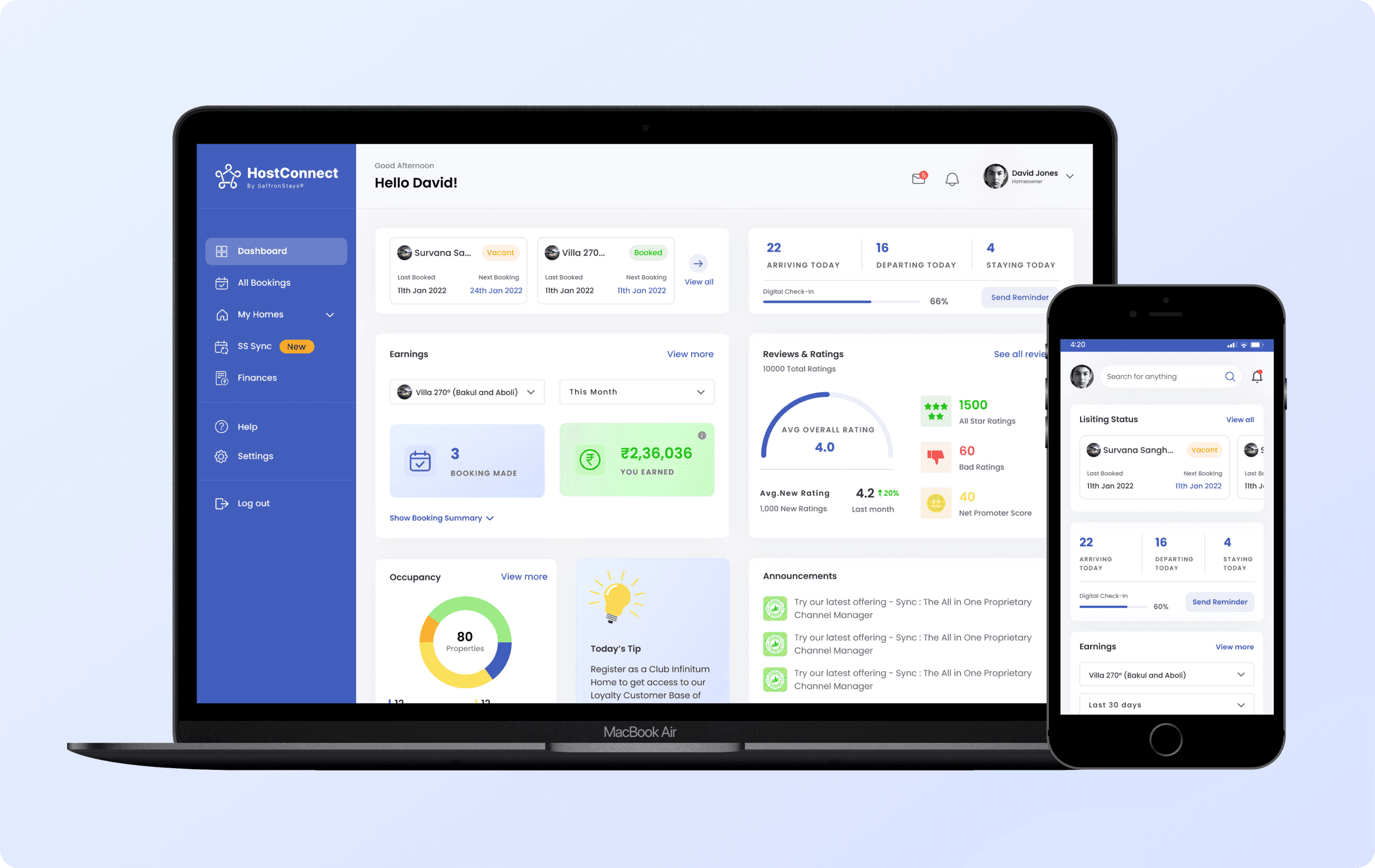
Product
HostConnect by SaffronStays
Role
Product Designer
Team
1 Designer
1 Product Manager
Stage
0 → 1 MVP
Project Overview
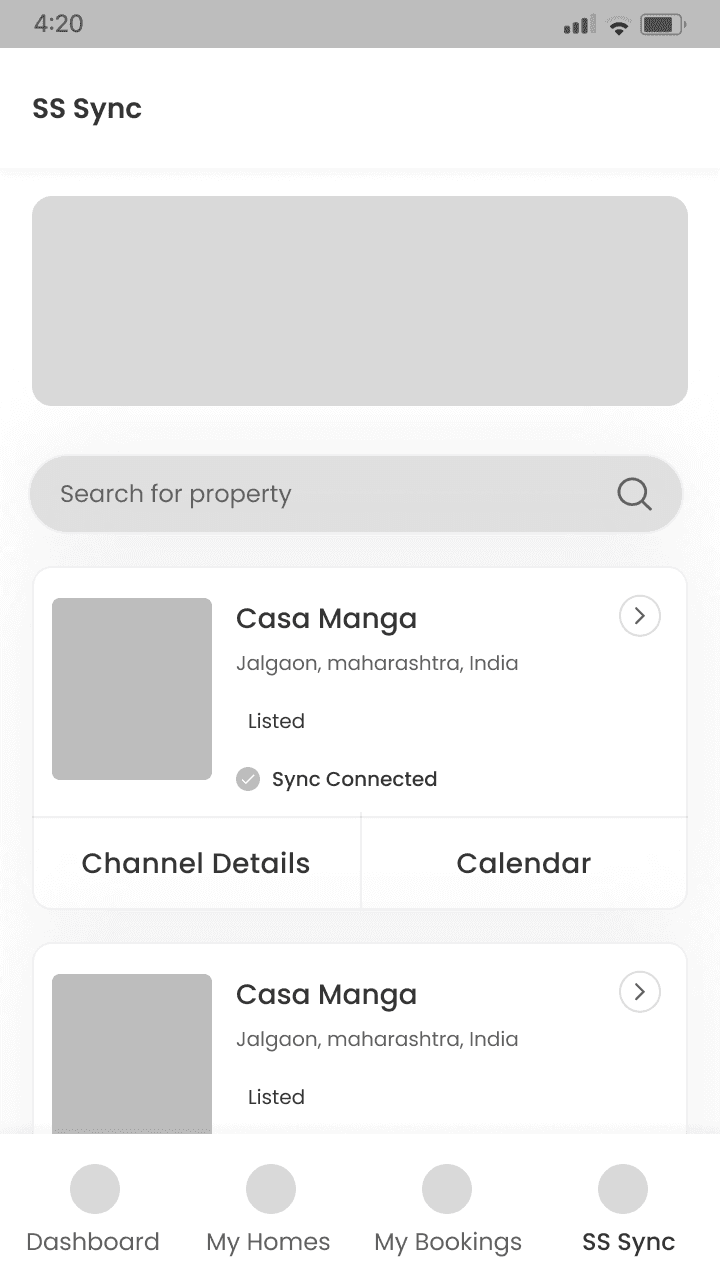
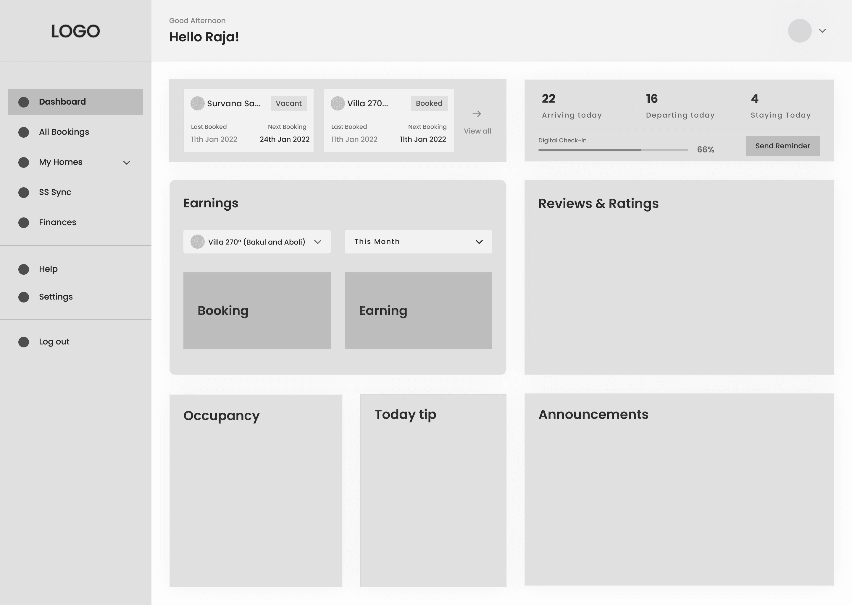
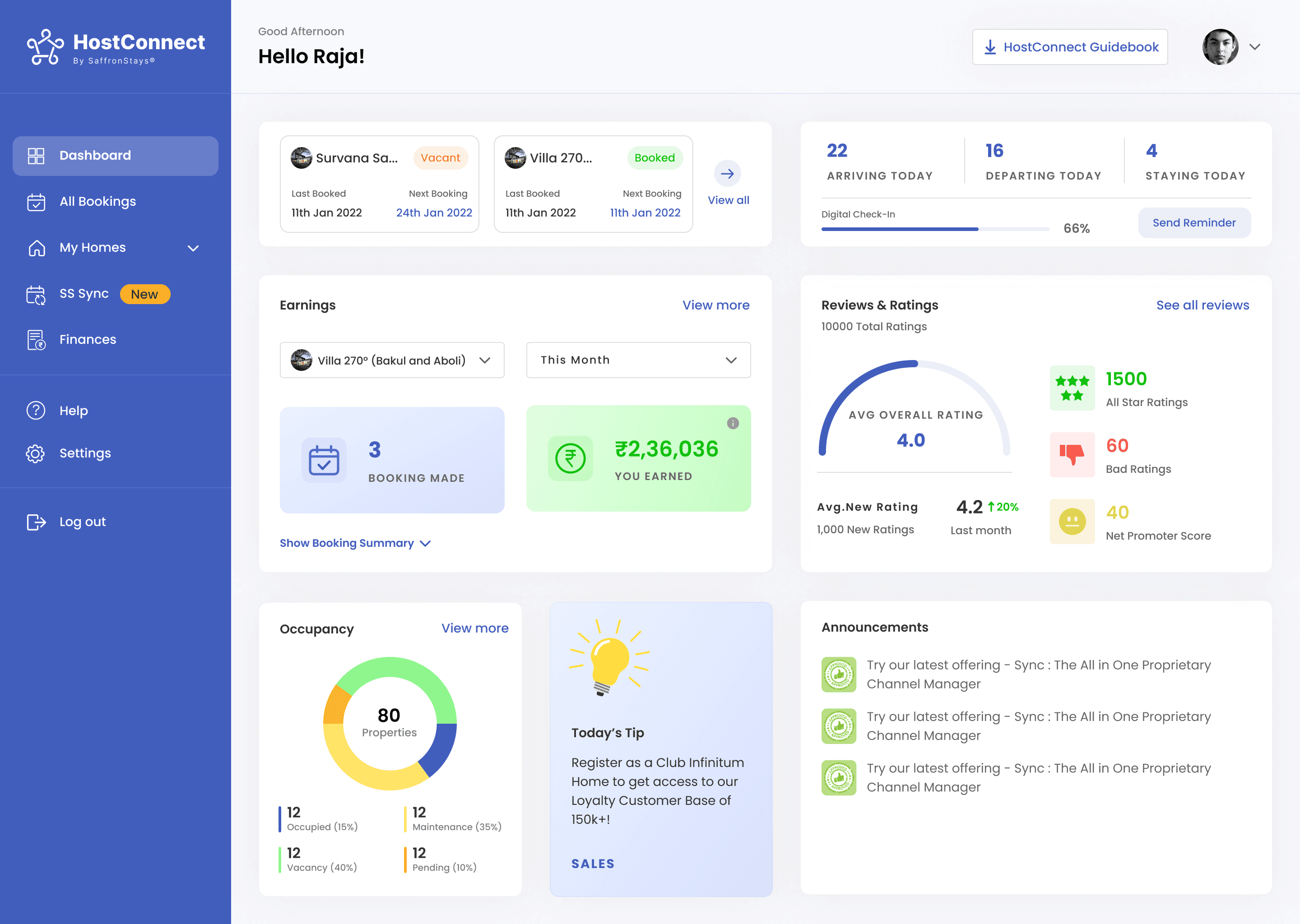
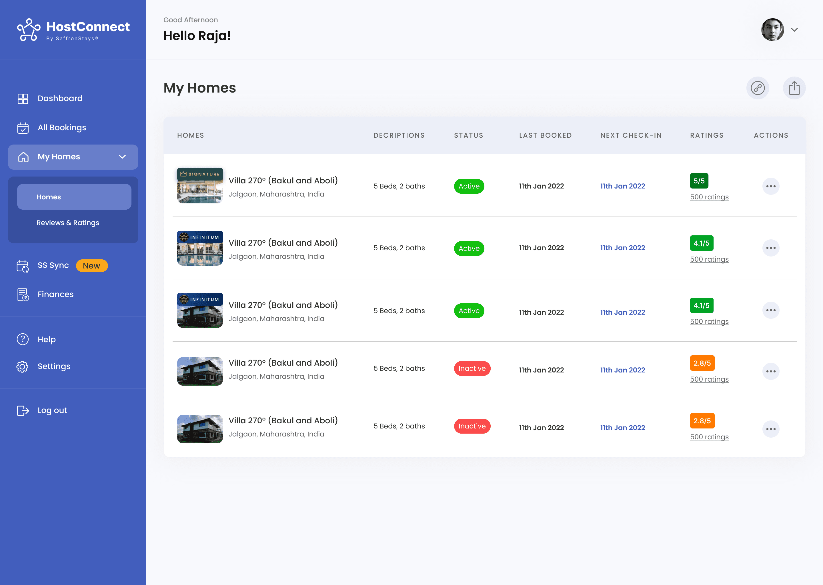
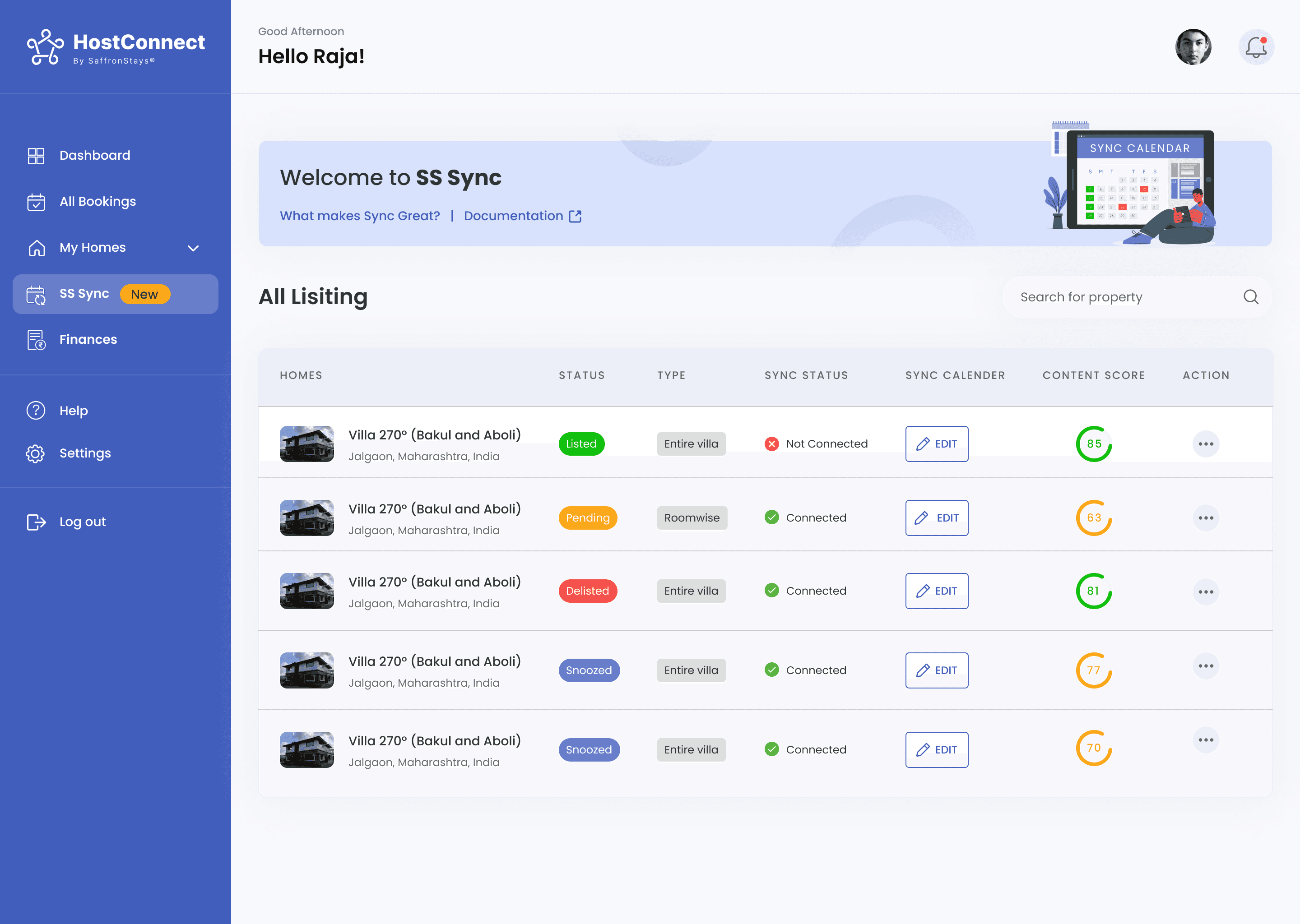
HostConnect is an all-in-one property management platform by SaffronStays that gives homeowners complete control over their vacation homes. From managing bookings, reports, finances, and maintenance to syncing rates across OTAs via its built-in channel manager Sync, HostConnect centralizes hosting operations into a single management experience.
Managing multiple vacation properties often involved fragmented communication, limited operational visibility, and time-consuming manual coordination between homeowners and property managers. The platform was designed to simplify day-to-day property operations through centralised management, faster access to critical updates, and seamless communication workflows.
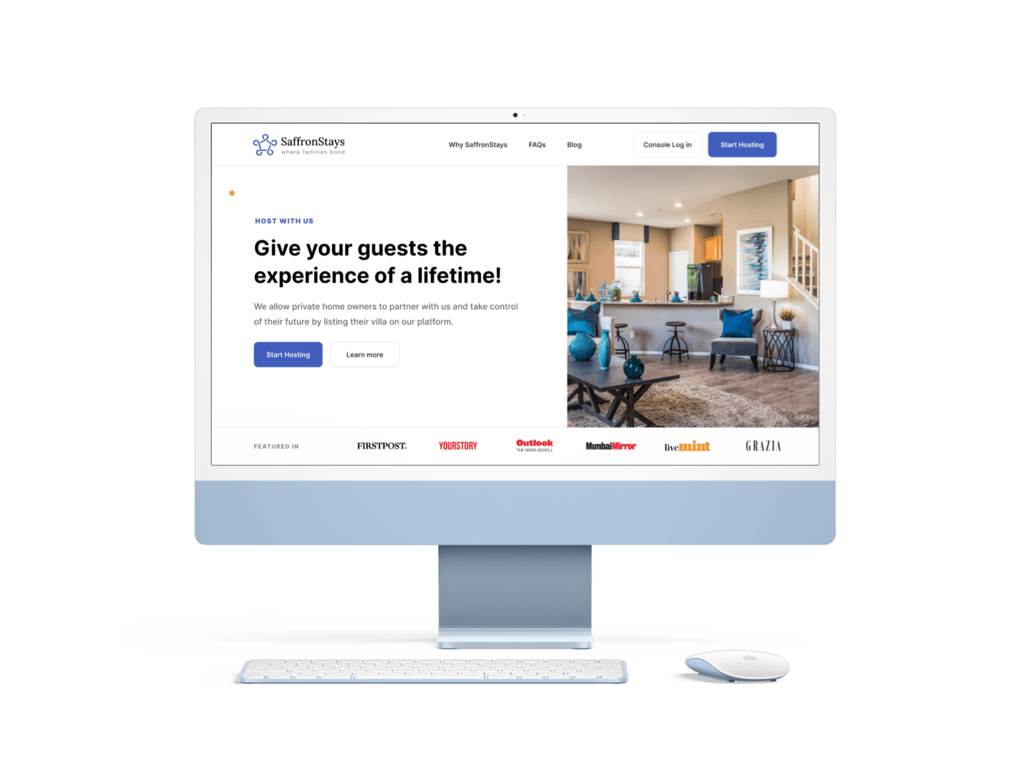
The Problem
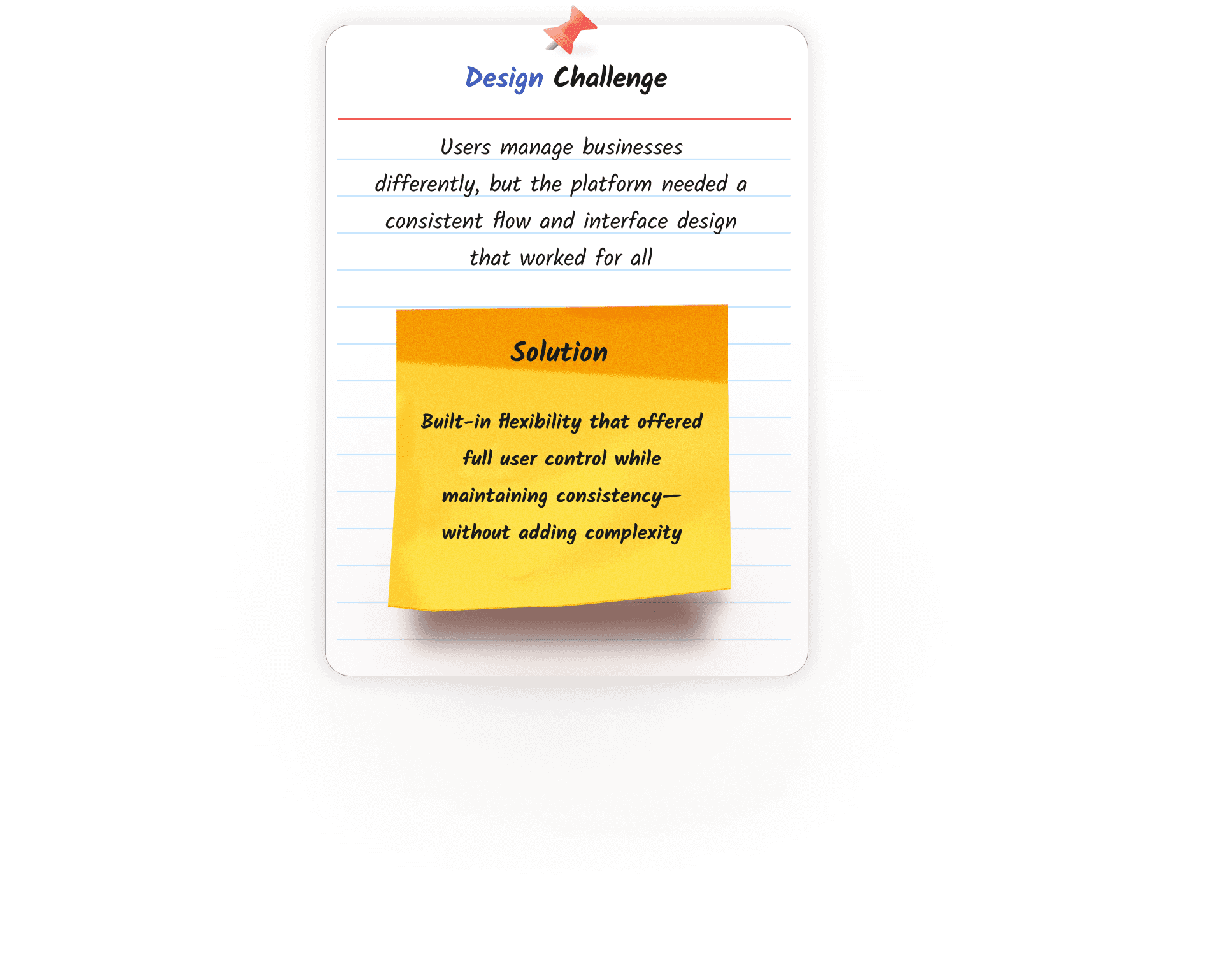
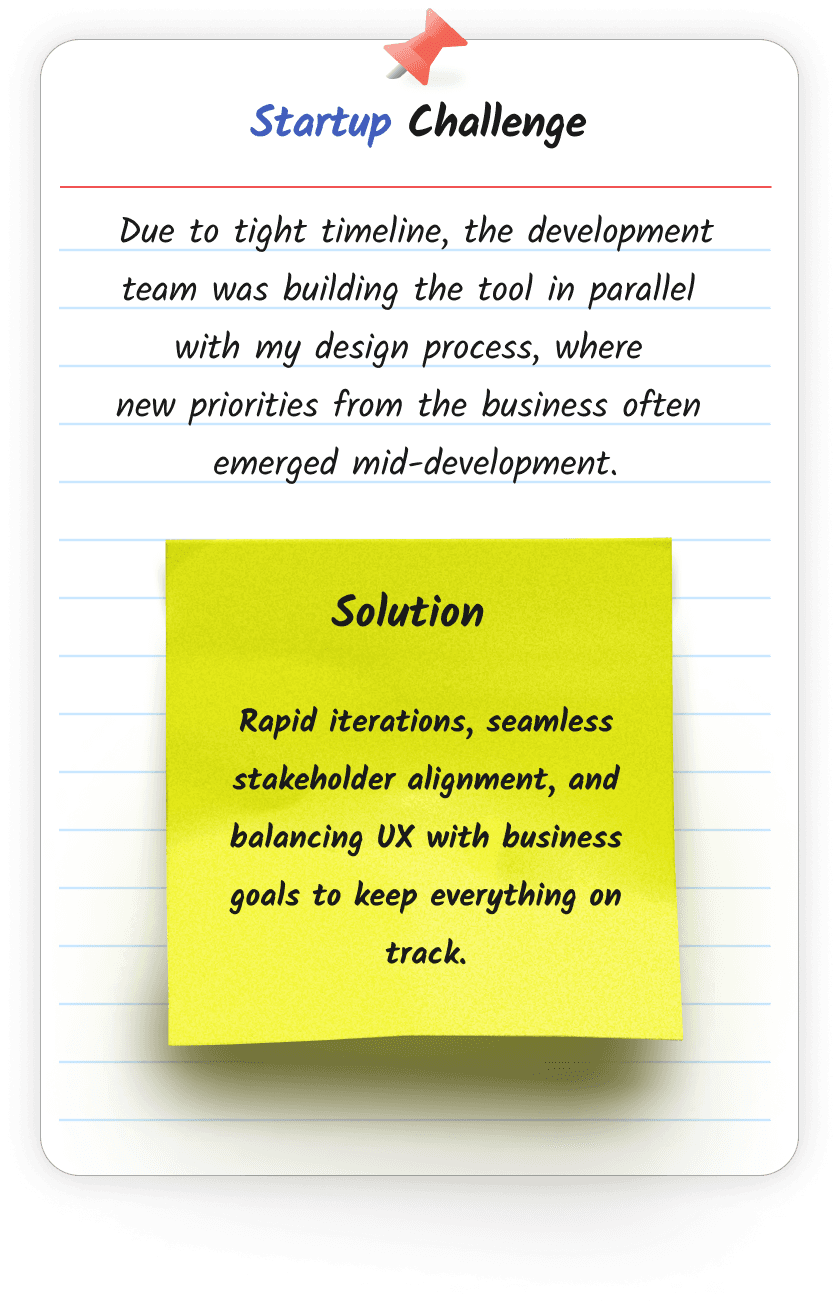
My Roles and Challenges
Results & Impacts
Design Principles
Autonomy Over Dependency
Homeowners relied on admin for every update. Every screen was designed to give them direct control no calls, no waiting, no middlemen.
Transparency Builds Trust
Progressive Disclosure
Property data is complex. Showing everything at once creates overload. Surface what matters first, depth on demand.
Who Are the Users?
The platform serves 3 key user groups:
1
I need a simple, centralised system where I can manage everything about my property without having to rely on someone else every time.

Rajesh
Homeowners
Oversees daily operations of the property, including bookings, availability, guest experience and revenue tracking. Wants autonomy, clear insights, and easy updates.
2
I want a system that reduces manual tasks and back-and-forth with homeowners, so I can focus on onboarding new properties and improving service quality.

Komal
Admin Team
Supervises all backend operations, assists homeowners, updates inventory and pricing, and ensures property data is accurate across OTAs.
3
I need a system that keeps me updated on real-time tasks and maintenance issues, so I can ensure everything runs smoothly across locations.
Amit
Operations Manager
Coordinates property upkeep, handles service requests, and ensures smooth day-to-day functioning of on-ground operations.
This case study focuses on Homeowners, a core group user.

What did the research find?
Research basis: 5 homeowner interviews + 2 admin team sessions conducted remotely over 2 weeks.
Research sessions revealed that users were less concerned about adding more features and more focused on simplifying existing workflows and reducing dependency on admin intervention.
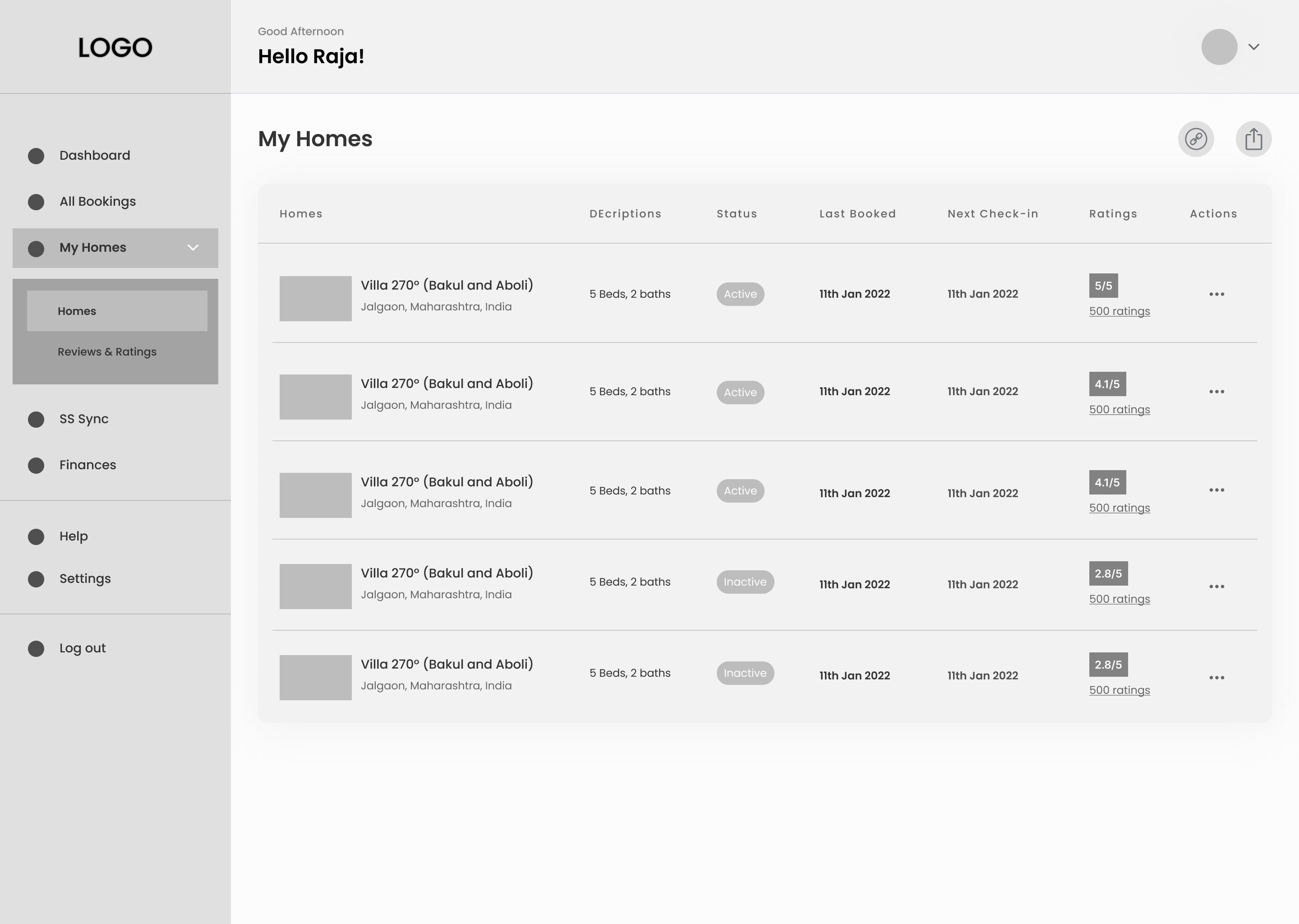
Currently existing tools for property management were fragmented with key features scattered across separate admin-only systems. Homeowners had no direct access, limiting control and causing frequent dependency on the admin team.
Operational Usability
Challenges
5 of 5 homeowners affected
Tasks like updating property availability, checking bookings, or accessing reports were either scattered across different tools or required manual admin intervention. Homeowners lacked a unified, intuitive interface to manage their properties independently
Limited Operational
Autonomy
Top frustration across all users
Because only admins had access to the management tools, homeowners had to rely on them for every update or query. This lack of control frustrated users and created bottlenecks in communication and task completion.
All 2 admin team members
The old system had multiple tools with inconsistent layouts and poor navigation. This caused friction when admins had to manage multiple properties, often switching between different screens and products.
While homeowners initially expressed frustration with fragmented tools, deeper discussions revealed that the larger issue was the lack of operational transparency and dependency on admins for routine tasks and updates.
"The research highlighted that scaling the platform was not only a usability challenge, but also an operational challenge. Homeowners needed quicker access to property information, while admins required a more centralised system to reduce repetitive coordination and manual dependency."
👉🏼
"Research revealed that homeowners primarily needed faster access to operational controls before advanced analytics or forecasting capabilities."
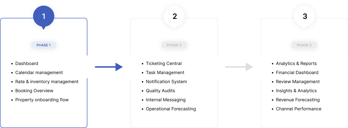
Solutions
🫧 How might we help homeowners quickly access critical booking information while reducing navigation friction and improving operational visibility?
🫧 Design Rationale
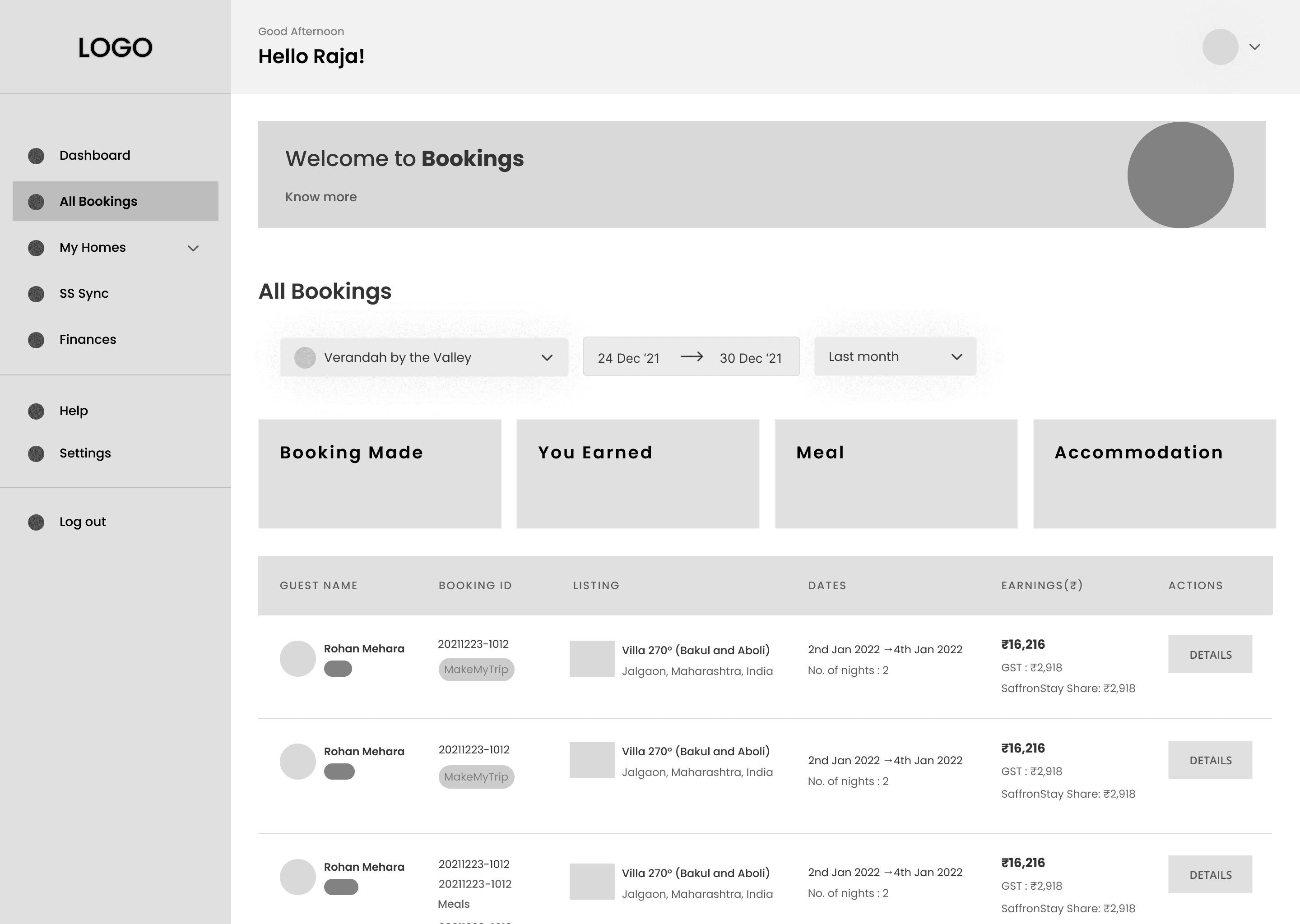
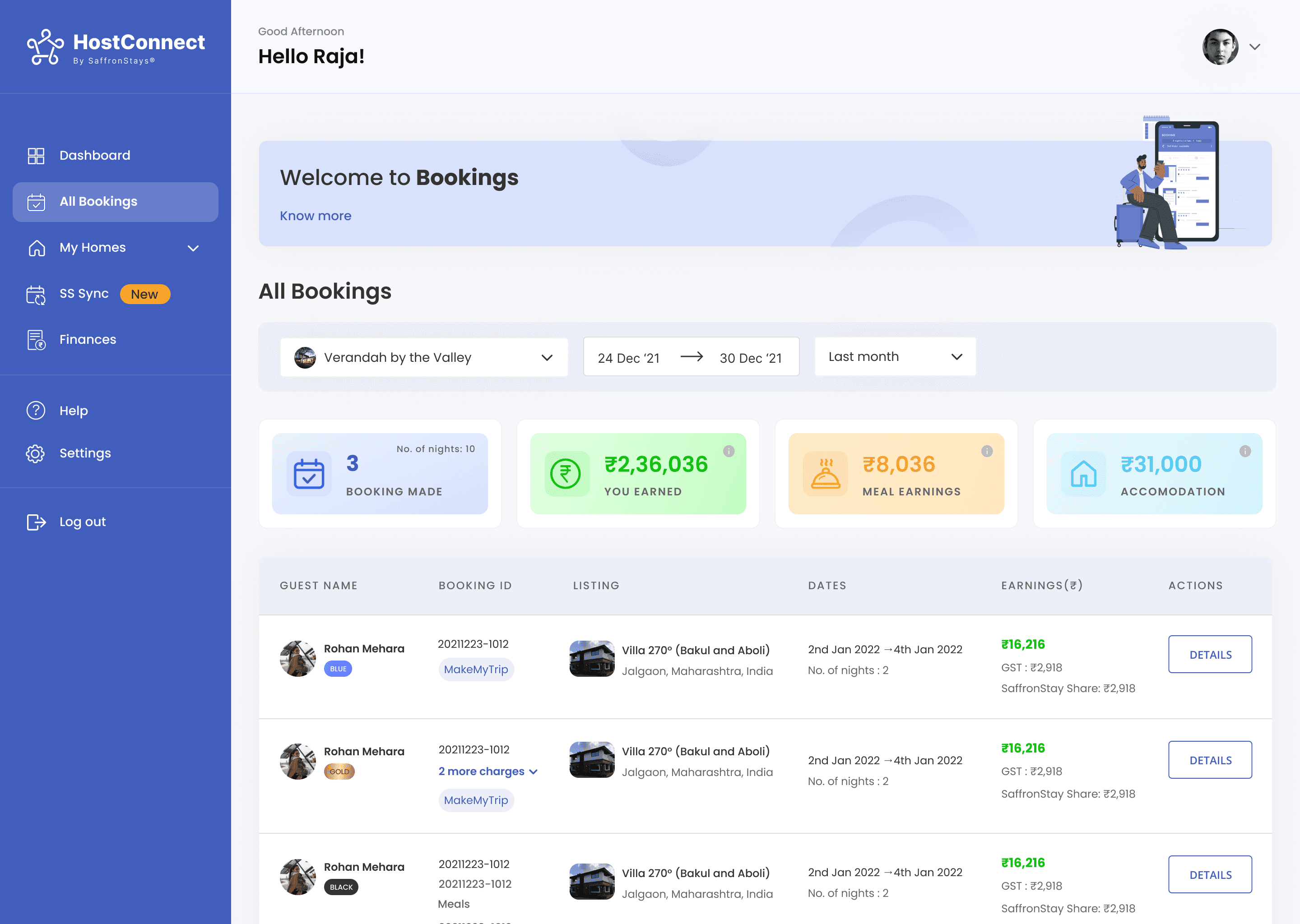
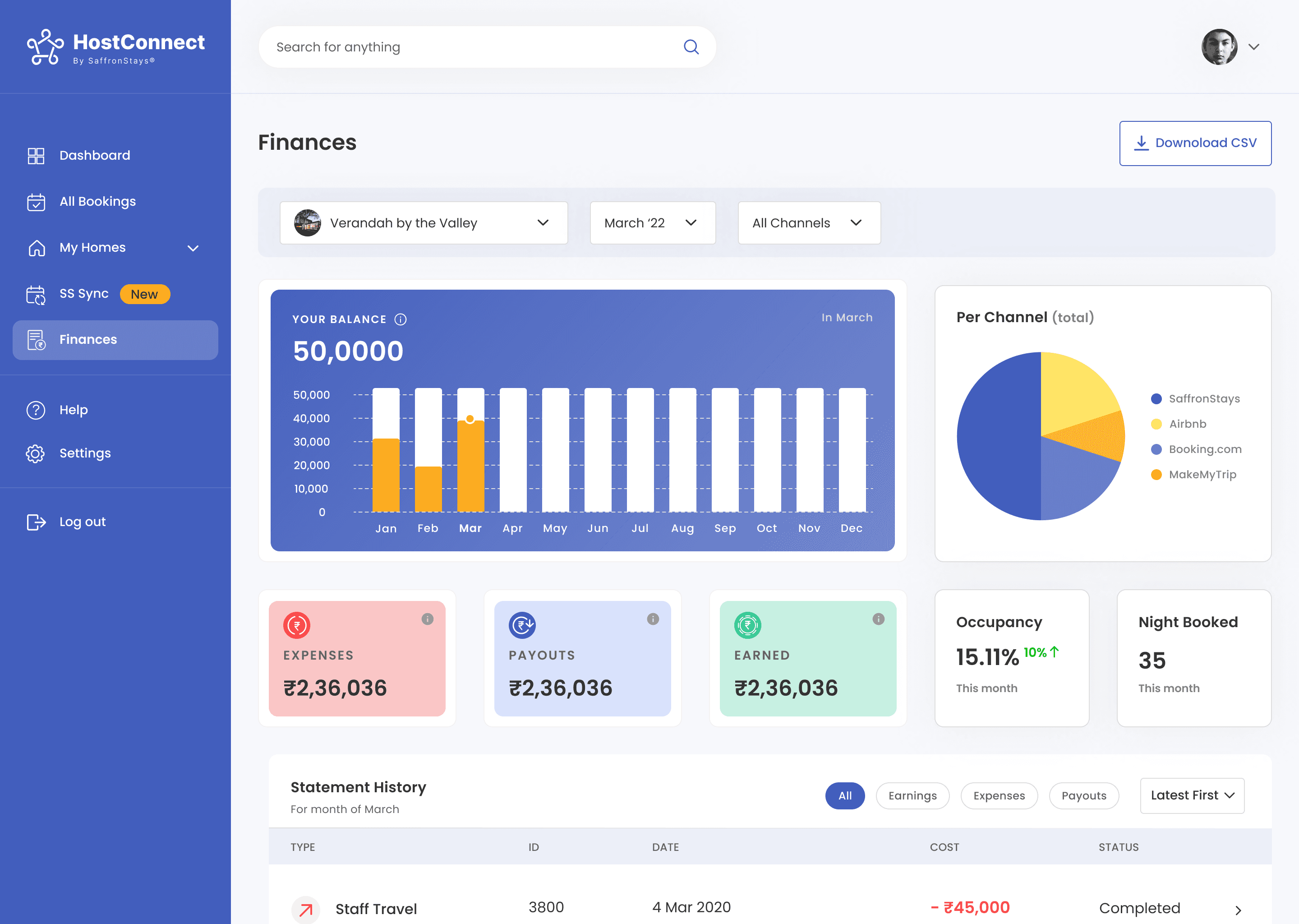
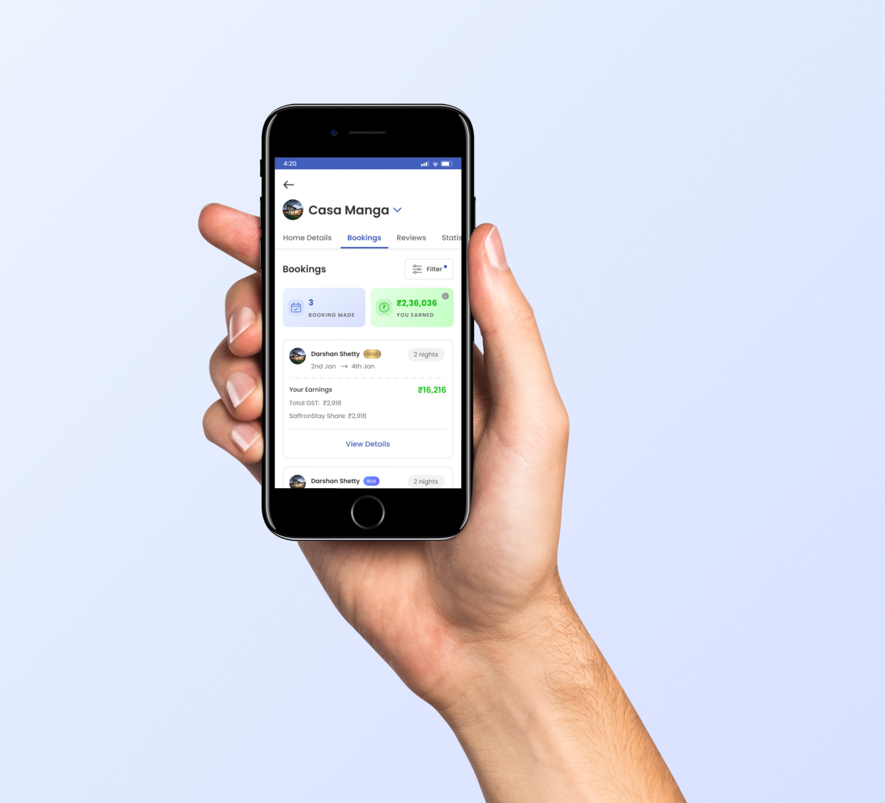
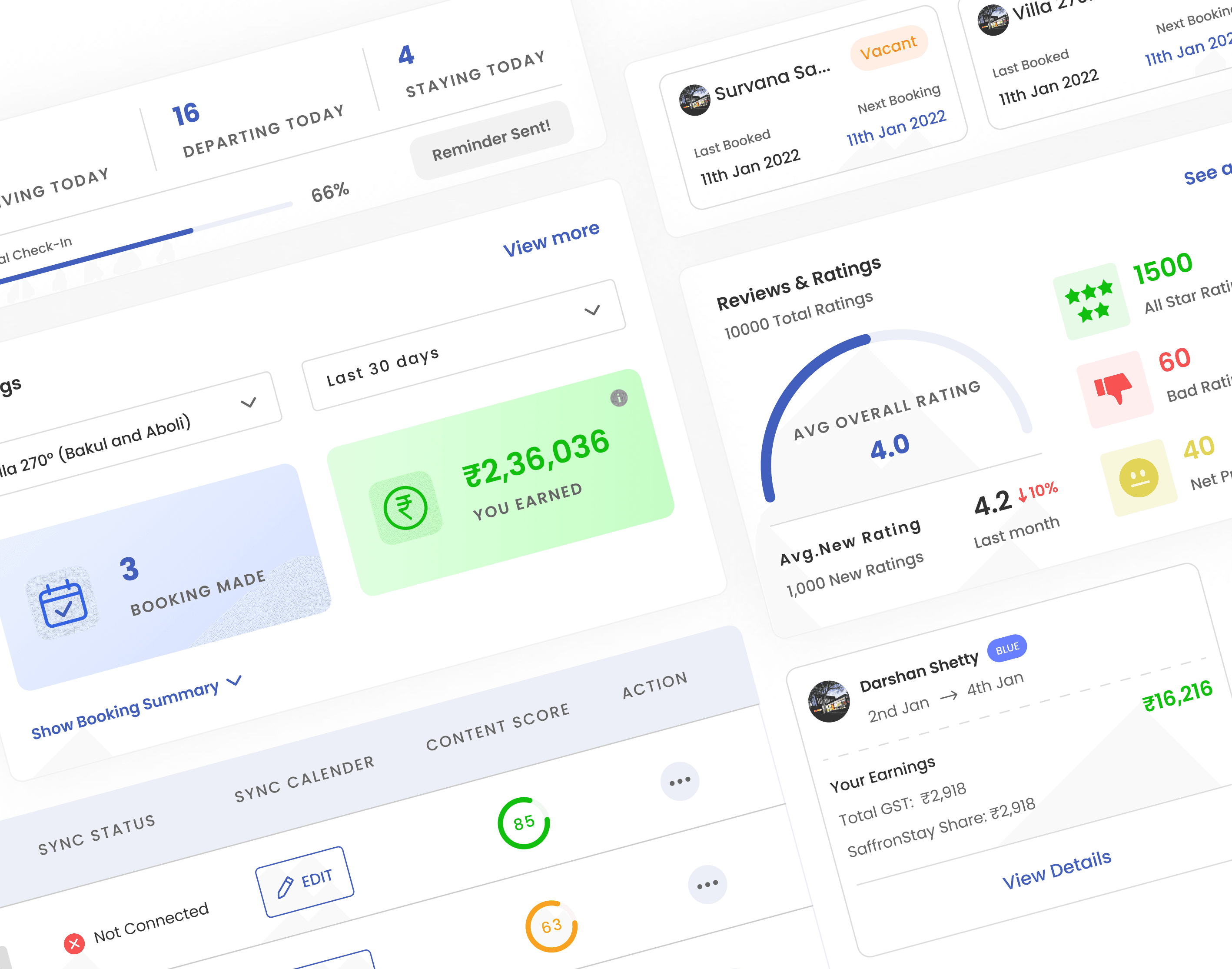
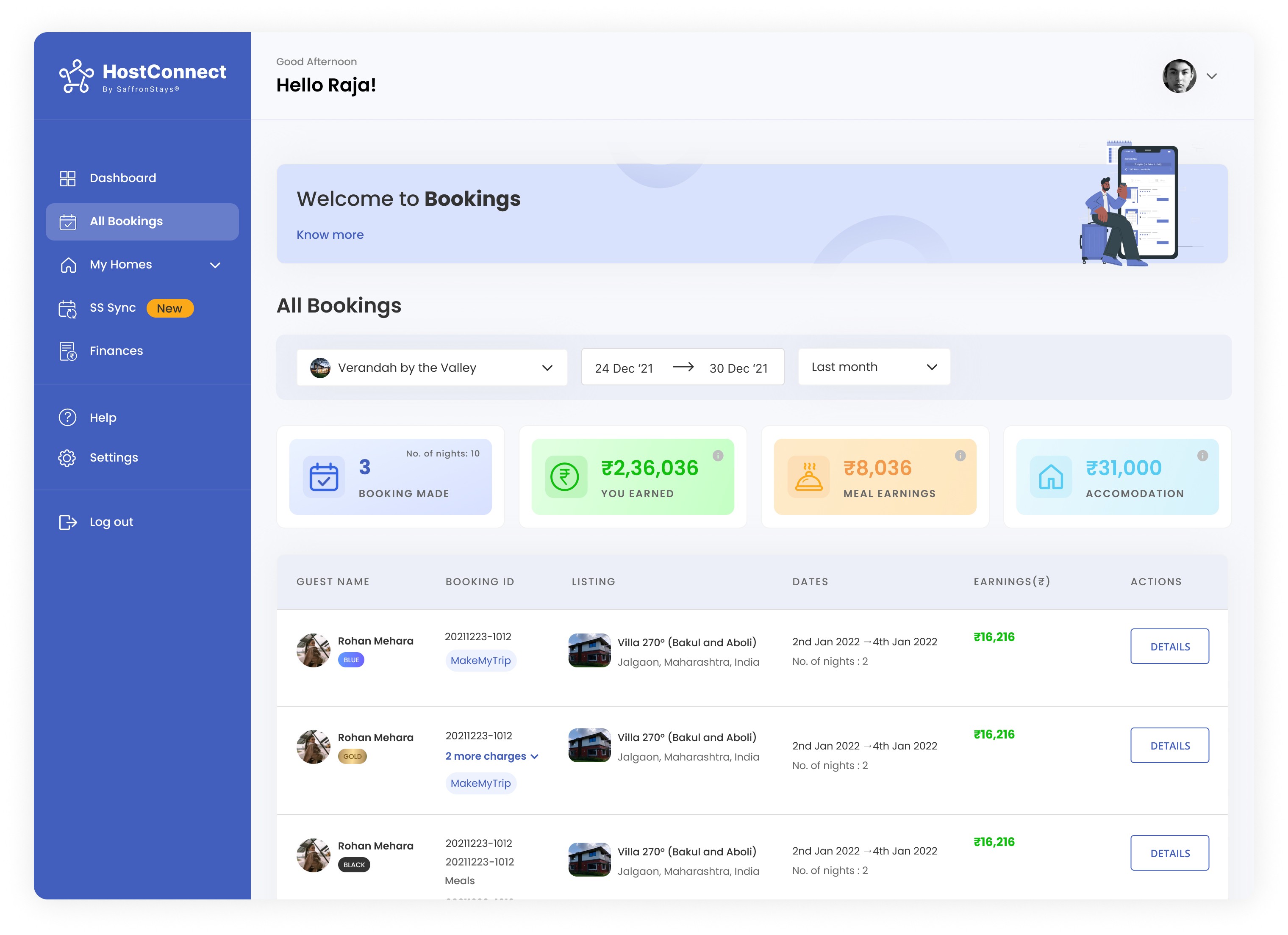
This approach aimed to give homeowners a quick pulse check on performance bookings made, total earnings, and category-wise revenue (meals, accommodation). We designed a summary-first layout to minimise mental load and help users identify high-value listings and booking trends at a glance.
The goal was to prioritise quick decision-making for homeowners without overwhelming them with excessive operational data.
✅ Why it worked?
High-level metrics (bookings, earnings) were prominently shown, offering clarity on business performance.
Clean, minimal layout with sortable lists.
The table format allowed quick scanning of guests, listings, and earnings.
Clicking "Details" gave access to deep booking-level insights
🚫 What didn’t worked?
Some users found it inefficient to access booking-level insights:
Usability testing revealed that while users appreciated the simplified overview, deeper booking insights still felt disconnected from the primary workflow.
Redundant info (same guest repeated multiple times for the same booking with split charges) cluttered the view.
No inline or quick actions (e.g. call/email guest, raise issue).
Over reliance on tabular navigation for core actions.
🤝🏻 Final Solution
🫧 How might we surface essential booking insights while enabling deeper actions without disrupting the user’s workflow?
💡 Design Rationale
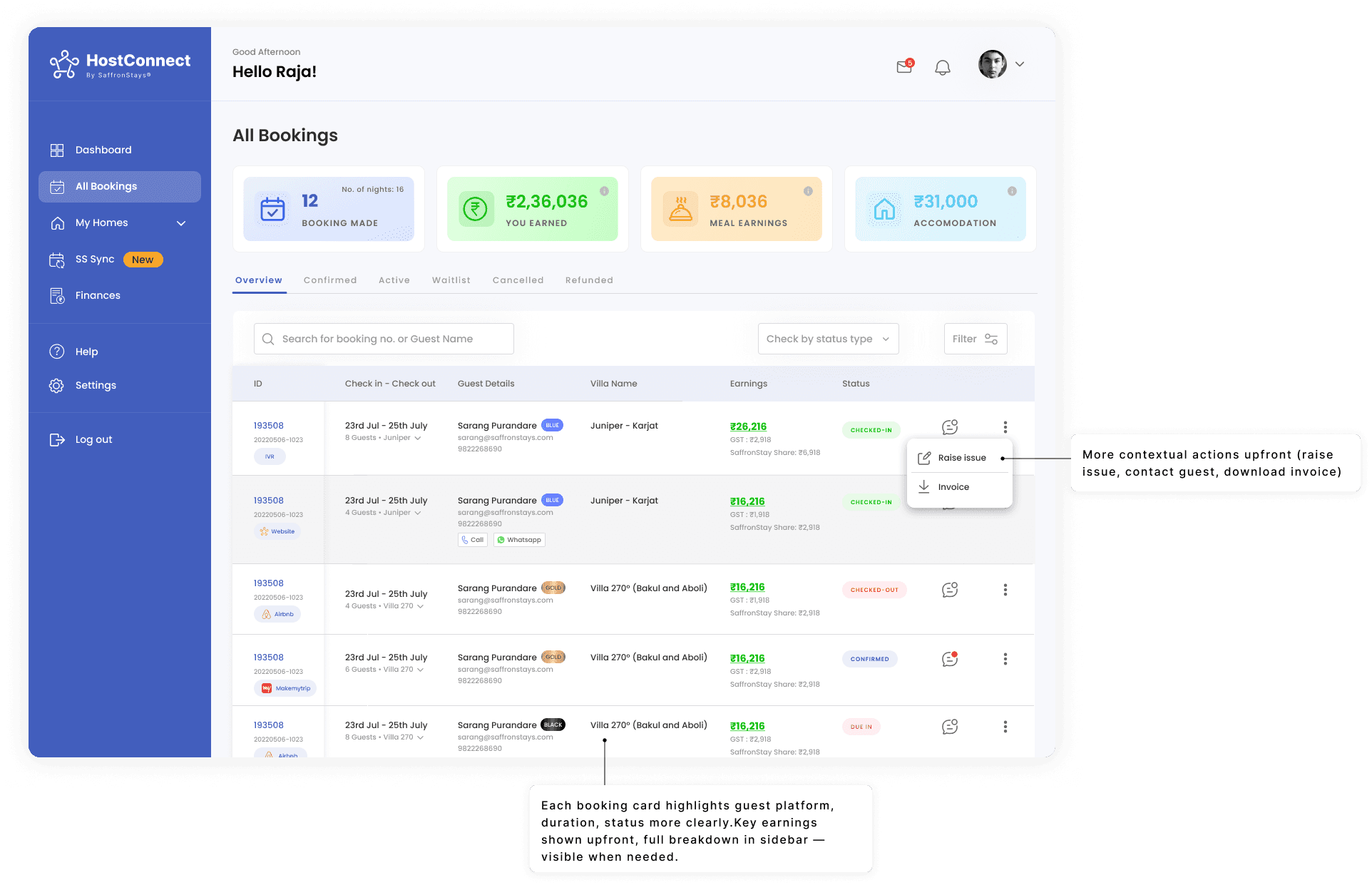
This version integrates progressive disclosure important booking details are kept in the main list, while deeper info (charge breakdowns, GST, SaffronStays share, meal/accommodation splits) is revealed in a slide-in sidebar panel only when needed.
This helped achieve a balance: simple overview + optional deep dive without losing context or overloading the interface.
✅ Why it worked?
Quick-access sidebar gives hosts all essential details (dates, charges, listing, earnings, guest platform) without navigating away.
Clean overview lets users focus on what matters most (guest, stay, earnings).
Smart grouping under one guest/booking avoids clutter from repeated listings.
Integrated inline actions (e.g., "raise issue", "call/ chat", "download invoice ") let hosts manage bookings faster.
Enhanced efficiency: no page reload, faster interactions, and better visibility.
Earned trust by giving control + simplicity flexibility in actions without cognitive overload.

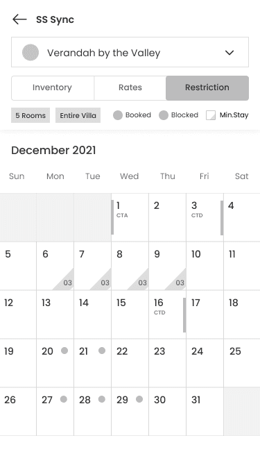
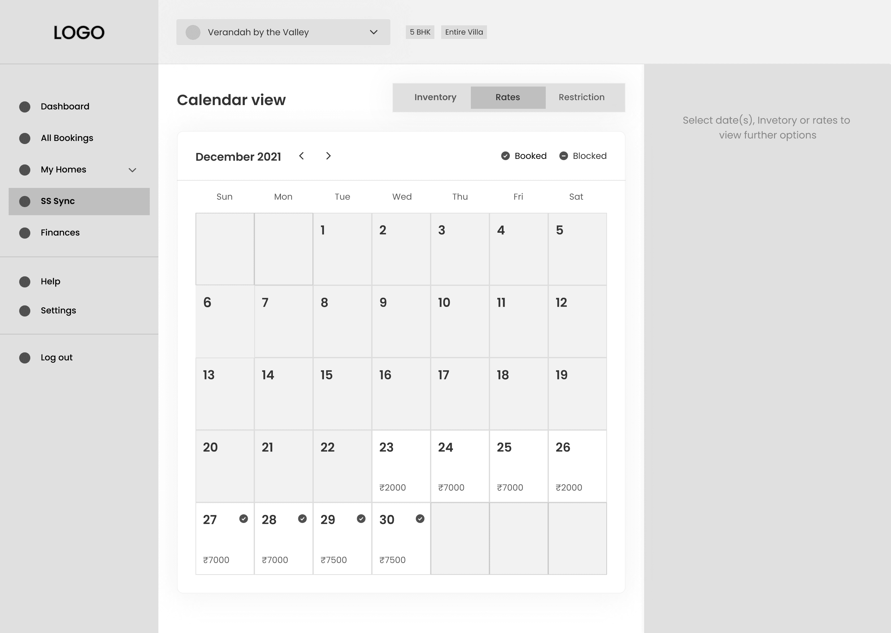
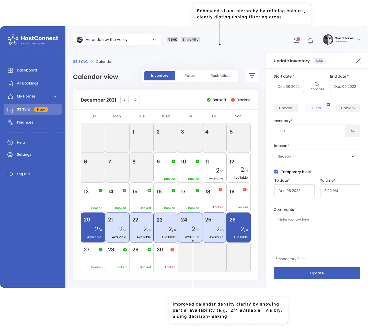
🫧 How might we simplify inventory and calendar management while improving availability visibility for faster operational decision-making?
🔍 The Problem
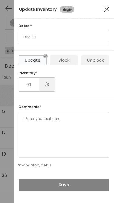
User interviews revealed a major pain point homeowners needed a way to quickly check availability and block/unblock inventory across multiple dates, while also knowing the current availability count at a glance. The workflow needed to support bulk actions without requiring repetitive back-and-forth interactions or increasing the risk of inventory oversight.
Limited visibility into inventory status slowed down bulk operations and increased the risk of manual errors during property management tasks.
🚫 What didn’t worked?
Although the interface supported date blocking, the lack of real-time inventory visibility made bulk scheduling actions less reliable and increased verification effort.
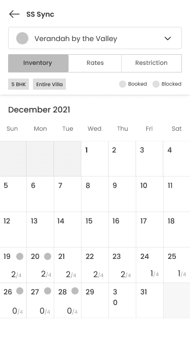
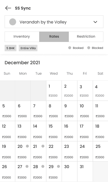
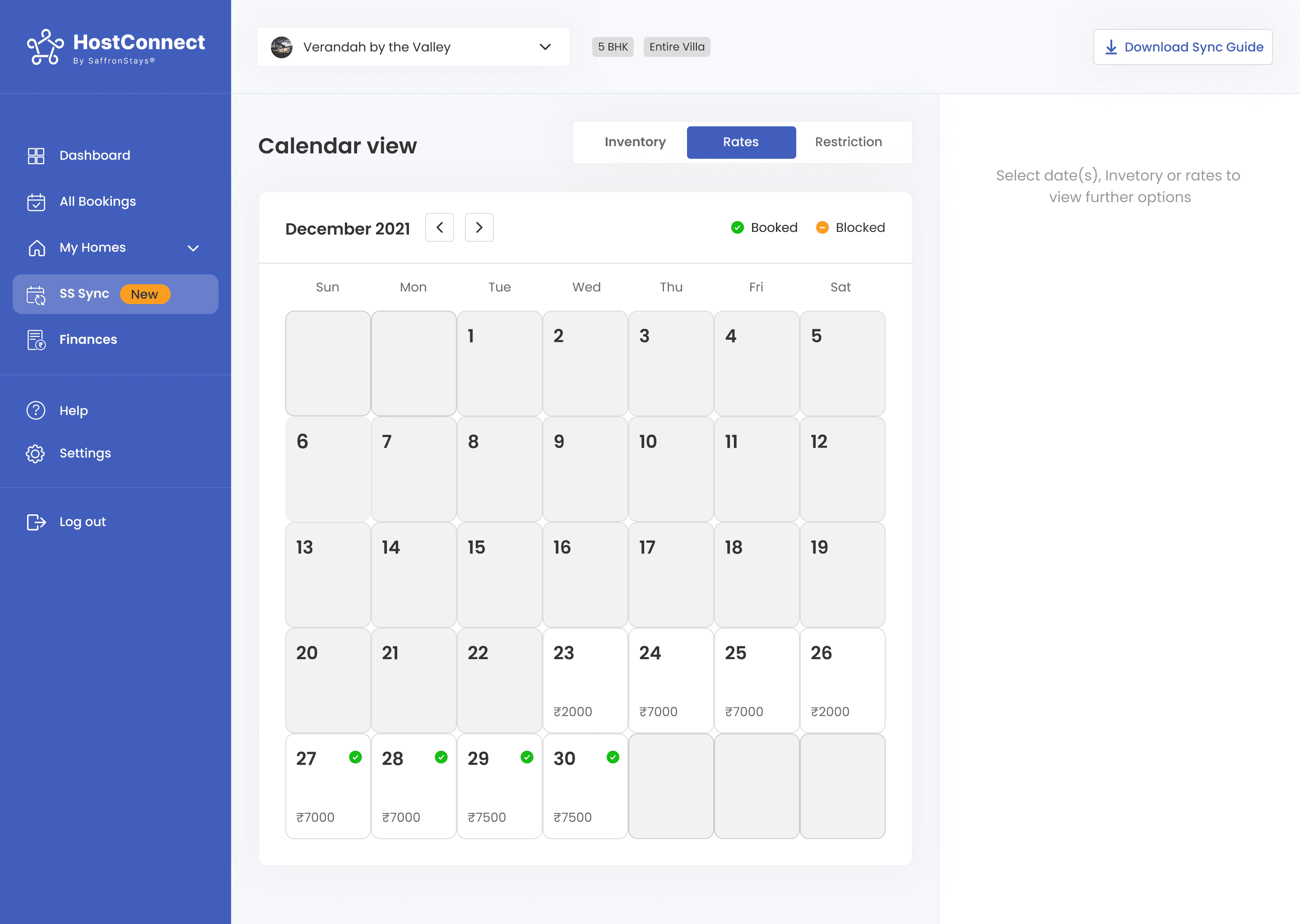
Admins couldn't see how many units were available on each day. The calendar only showed "Booked" or blank cells, which required extra effort to verify availability manually.
💡 Final Solution
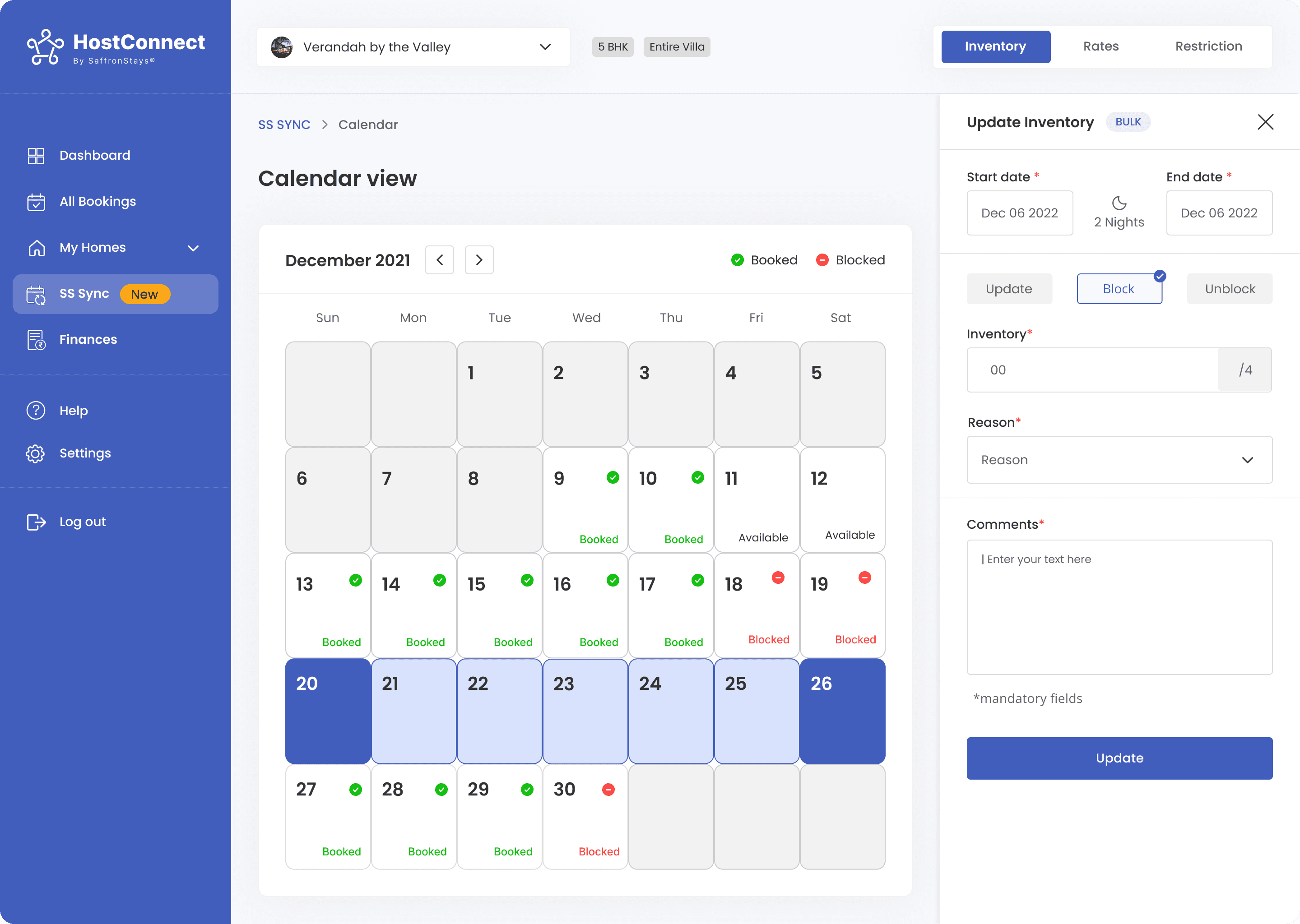
The final solution improved operational visibility by surfacing unit-level availability directly within the calendar, allowing homeowners to make faster scheduling decisions without additional verification steps.
💡 Design Rationale
✔ Enhanced availability visibility by showing unit-level data directly on each date cell.
✔ Improved visual hierarchy using colour-coded statuses (booked, blocked, partially available), reducing cognitive load.
✔ Consistency in layout ensured familiar workflows were retained while enhancing clarity.
🚀 The Impact
This improved operational clarity by making inventory availability instantly visible, reducing manual verification effort, and enabling faster bulk scheduling actions.
System Thinking: Built for Scale, Not Just Screens
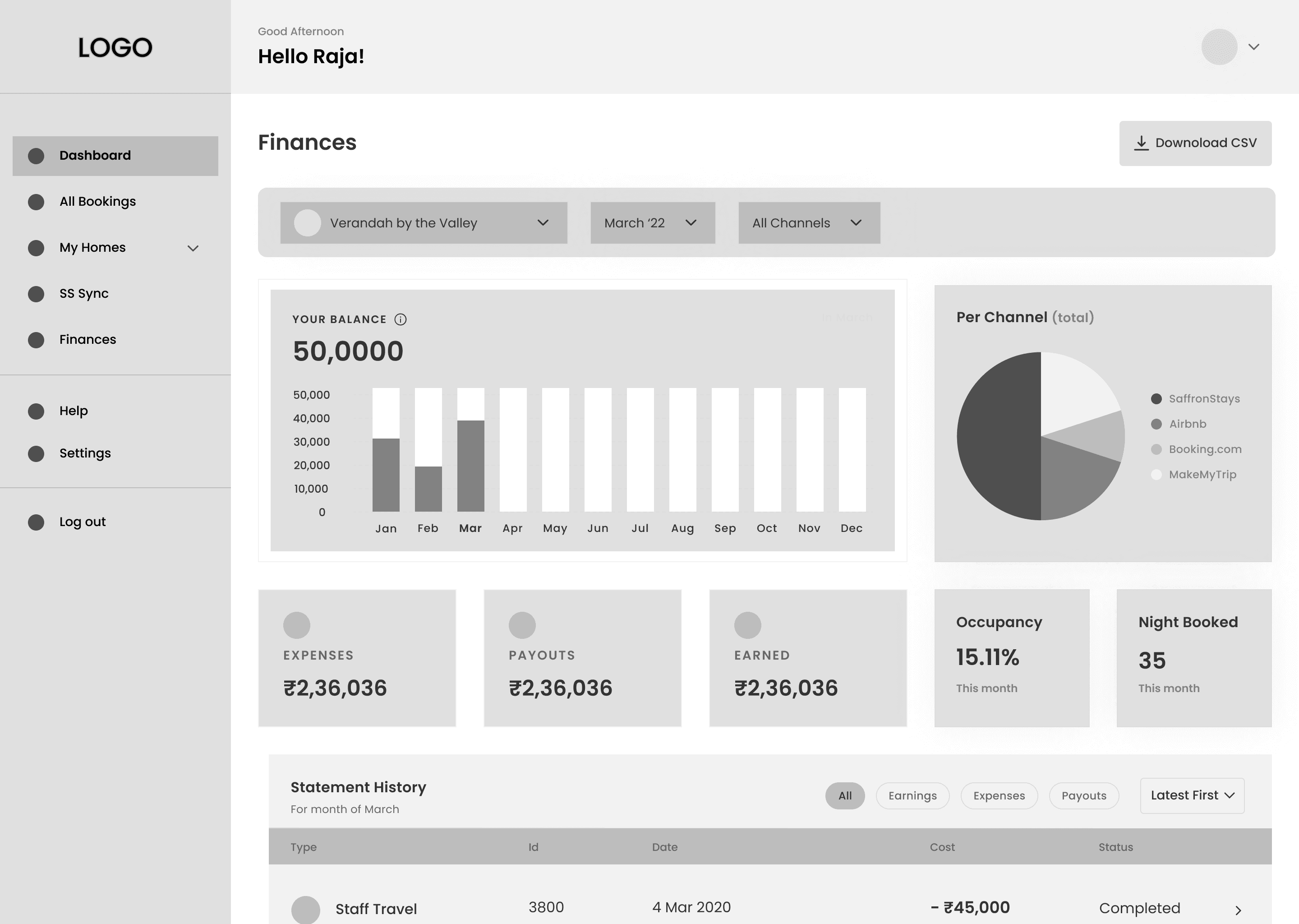
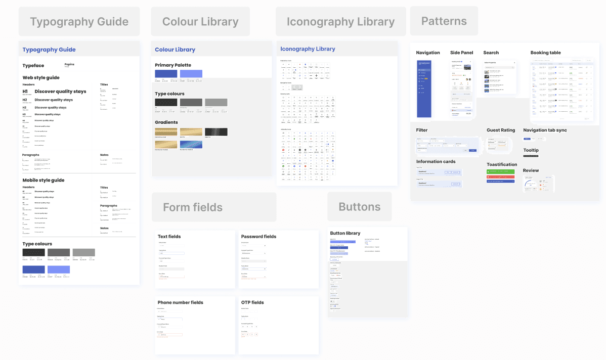
While Phase 1 focused on delivering the most critical homeowner workflows, I also established a scalable design system to support future product growth. Beyond visual foundations such as typography, colour, and components, I created reusable interaction patterns for navigation, tables, filters, side panels, and notifications that could be consistently applied across bookings, inventory, finance, and maintenance workflows.
This helped maintain a cohesive user experience, streamline developer handoff, and accelerate the rollout of future features without redesigning core interactions.
🚀 PROJECT IMPACT
Business Impact
60+
Homeowners empowered since launch, with simplified property management workflows .
Revenue Growth
4x
Increased monthly revenue 4x within the first quarter post-launch by consolidating multiple tools into one platform.
User Impact
200+
Active users surpassed, driven by organic referrals and strong platform advocacy among the host community.
🫧 Key Takeways
What this project taught me as a product designer.
Build the design system
before screen one
Designing HostConnect from scratch reinforced the importance of establishing reusable components and interaction patterns early. Creating a shared foundation upfront helped maintain consistency across bookings, inventory, finance, and maintenance workflows as the product evolved.
Prioritisation is a design
decision
One of the most important decisions was focusing Phase 1 on homeowners before expanding to additional workflows. Defining clear scope boundaries allowed the team to solve high-frequency operational tasks effectively instead of spreading effort across multiple user needs.
Testing early creates better workflows
Several key interactions evolved through iteration. Observing where users hesitated revealed workflow gaps that were not obvious during design reviews, leading to solutions that improved operational visibility and reduced navigation friction.